 |
| Footprints 22 | Masthead by Zhu The Grove of Ghost-lights by Markus Holzum |
The nameplate design is based around is a subtle visual pun with the lettering almost looking like a monster, perhaps a dragon, a demonic goat, or a basilisk or some such beast of our imagination standing on the line ...leaving footprints... which also references physical printing, the line being the substrate and the being the blocks. Subtleties aside, the aim was to create something clean and contemporary, whilst embracing the legacy of TSR era D&D, both attitudes which the magazine personifies, and it succeeds in that.
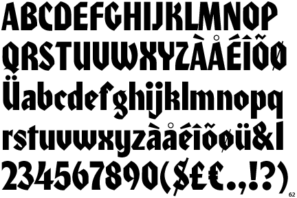
The lettering is based on ITC Honda Designed by Ronne Bonder, Tom Carnase and Bob Newman and published in 1970. It's the same typeface used by TSR for their Dragon magazine from 1979 to 1992, and was chosen to continue that tradition. Similarly the word "Magazine" and the strapline was set in Century Gothic for it's long association with TSR publications, and specifically its use on Dungeon magazine. and creating a modern / archaic. light / heavy contrast with the Blackletter Honda.
 |
| ITC Honda | ITC 1970 |
The layout design has been handled by Michael Haskell and Jeff Johnson, and they've done a great job on the typography and re-purposing public domain images to illustrate the mag. There are lots of nice touches - the title of "Pulling Strings" reminiscent of the creative lettering that Polly Wilson used to do for the Fiend Factory monsters in White Dwarf back in the day.
But what of the content? Well it is filled with magical items, traps, giant spiders and more - but don't take my word for it - go download! Download Footprints Magazine 22


You never fail to amaze me with the amount of details and precision you can put with what would just be a nameplate for most people.
ReplyDeleteAnyone taking the time and energy to give a meaning and some depth into his own work earns my respect and admiration.
Cheers JB, Gald you like the design and the thinkstuff.
DeleteFlattery will get you nowhere, the Dwarf still has every chance of falling down a random pit trap!