
 |
| The History of Lower Middle Earth: Part One |
"Don't judge a book by it's cover" goes the old cliche trotted out to denigrate the fine and exacting work carried out by illustrators and book jacket designers the world over. But no, book jackets are important. Not only do book covers serve as marketing tools to entice hapless saps to pick-up some half-baked tome of drivel off the creaking shelves of their local black-windowed publications emporium, they also serve as a flag of social stigma and embarrassment should one undertake the social faux-pas of carrying or worse, actually reading a book conspicuously in public. This, of course, explains the popularity of e-book readers. It's not the convenience of carrying 40,000 digital documents in your pocket, which is quite pointless as none of them appear to have that exact recipe for mixing the perfect Pan Galactic Gargle-Blaster that you're looking for when you need it.
 |
| I could really do with one of these about now | via |
No, the real value of polymorphing books into anonymous grey plastic rectangles is that one can sit in a coffeeshop in Rickmansworth sipping a skinny latte or stand on public transport on the commute to work whilst reading Shifty Shapes of Grey without the risk of anyone batting an eyelid, and avoid being even slightly embarrassed about peering at the grimey print hidden behind the glossily airbrushed homoerotic thews of Gonad the Barbarian, or being pelted with rotten fruit for reading the XXVII tome in the Horribillis Hearsay of the Grimdank Universe series. Or indeed, avoid entirely the intense social stigma and certain ridicule that comes from wielding a mini-placard embellished with the hookah-pipe and mighty bosom of a militant mutant sow riding pig lady and curvaceous elf girl astride a black ram emblazoned upon on The Harvard Lampoons Parody of J.R.R. Tolkien's "The Lord of the Rings": Bored of the Rings that announces loud and proud your lack of literary discernment and pervy stoner nerd credentials.
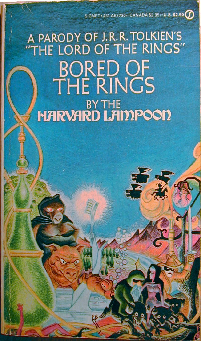 |
| Bored of the Rings | Michael K. Frith | 1969 |
Considered in isolation, the cover of the Signet first edition of Bored of the Rings is a thing of finely crafted wondrous beauty. The composition is harmoniously balanced, rendered in jewel-like colours and with montage reflecting oneric, fantastical vision, oozing with quirky detail and charm. The combination of visual splendour, simple messaging and dubious sexual content make it a near platonic ideal of the most effective persuasion technologies of the commercial arts of Madison Avenue. But before we indulge ourselves by observing the contents of the cover in Bored of the Rings in minute yet pedantic detail, it behoves us to turn our baleful eye towards the first American paperback edition of The Hobbit published by Ballentine in 1965.
 |
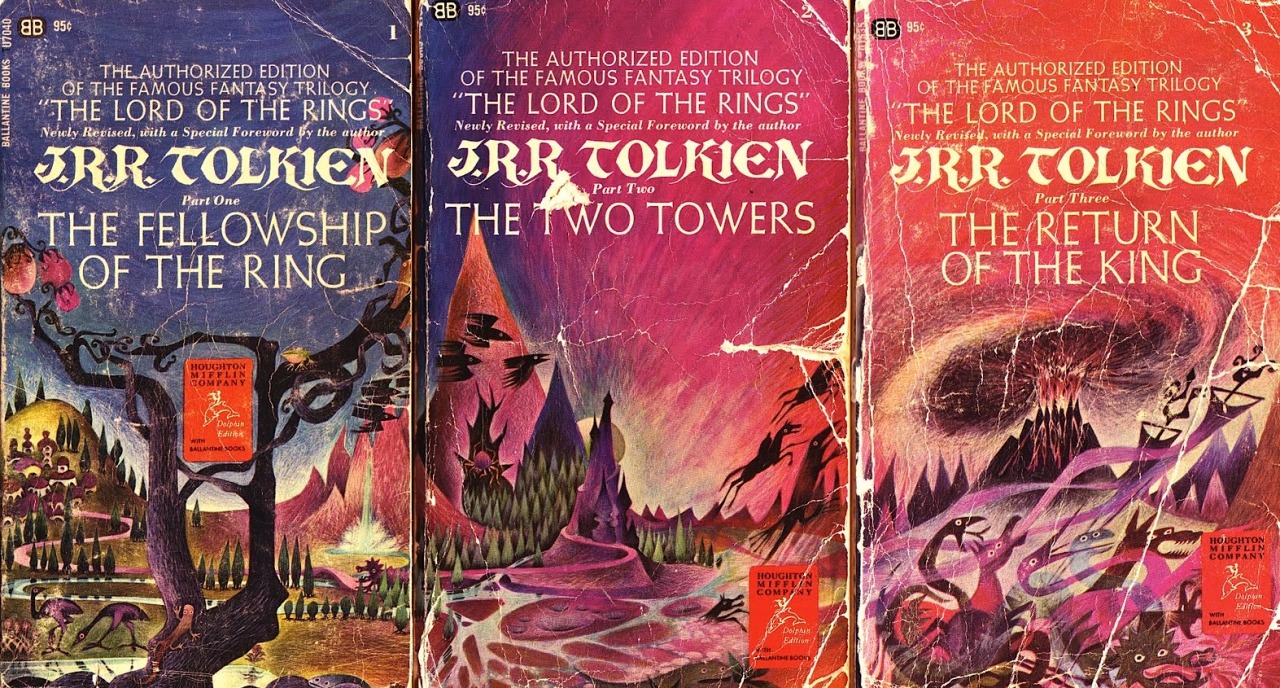
| The Hobbit | 1965 |
Upon observing this exquisitely wrought jewel of mid 60's pop-psychedelia, the author of the book had this to say (with moderation) on the matter:
It is at about this point when writing an article, when it is traditional for the Scribes of Zhu go off on a third pointless tangent, weaving the text into a kind of pseudo-intellectual equivalent of a bunch of dozey Boggies poking aimlessly at some suspicious looking fungi in their back garden when they said they were going to take the recycling bin out to the Dark Lands beyond Bakdôr. This is usually because the aforementioned scribes have got completely bored with the original subject, but also to pad out the post with as much verbiage as possible in the vain hope that the reader is distracted by the advertisements on the right hand side of the website and decide to buy an Oldhammer T-shirt or maybe some Dungeon Floorplans. And this article will prove, regrettably, no different.
Unfortunately Barbera Remington's paintings for the covers of The Hobbit and The Lord of the Rings gives us the perfect, but also ideal, material for just such a meandering diversion. Having already discussed at inordinate and mind-numbing length the vicereal physical response by the esteemed yet grouchy author of the original book to the artwork, and its profound yet significant influence on the cover of Bored of the Rings it is perhaps not too far fetched to examine the legacy of this maligned work of genius beyond the confines and out into the wide world beyond the paperbacked borders, and into the nefarious realm of knock-off-publishing and authorised fully-licenced merchandising tie-ins that is the sordid yet mysterious world of Fantasy Gaming.
Remmingtons rendering of the power of evil to materially distort the doors of perception and stain the world with evil was something Ralph Bakshi had played with while working on Spider-man, where the development of the psychotropic mise-en-scene as mirror of a tortured mind was no doubt partly responsible for the lurid evil kaleidoscopic effects seen in Bakshis great cinematic adaptation of The Lord of the Rings.
Leaving the unspeakably middle double-constonanted family tree of Hobbit, Boggie, Fraggle (and Hoggle from Labyrinth) aside, not to say, chopping the whole thing down for the sake of all our sanities, we return to the cover of The Bored of the Rings. Here we can see Frith was less following in Remmingtons esteemed footsteps than creeping up behind her with a cudgle, ready to mug every last ounce of artistic license available. Having waded through the groan inducing pun-drenched excuse for a novel, myself it's clear that Frith either, like Remmington before him, just didn't have time, or just couldn't be bothered with it or thought he had a better idea of what should have been going on. And who could blame him? It's hard to know where to begin, except to say that having a cover so profoundly divorced from the narrative contained within could only be part of a studiously wrought meta-parody - perfectly reflecting the Ballantine editions lack of fidelity to the text. Pure coincidence, or rather pure lack of coincidence, could not have missed the mark so astutely.
The Nozdrul - evil servants of Sorhed only dress up in lady pig costumes while they are in disguise in the sordid and provincial village of Whee, but not riding around the country-side on the back of giant pigs, which they do all the time. I suppose this shows Frith had made some acquaintance with the text, but really either didn't care about the basics or couldn't pass up the opportunity to paint a pig riding pig.
The buxom sow-riding pig-woman Nozdrul is a blindingly genius concept of geniusness. It's hard to overstate the sheer cultural impact and magnitude of this perilous porcine picture. The fearsome yet saucy Nozdrul as buxom pig-lady predates the creation of the fearsome yet glamorous buxom pig-lady Miss Piggy (designed by Bonnie Erickson at the Jim Henson company) by a whole seven years. The Hildebrandt Brothers infamous but debatable Lizard Goblin Pig Orcs by the same seven years and the emergence of the archaic yey porcine Pig-Faced Orcs of Dungeons and Dragons by eight. All in all this may be the first image of an anthropomorphic pig riding a pig in all of humanoid history. Then again, it probably isn't. But it's certainly an image that joins the dots between Tolkienesque Fantasy and pig-headed humanoid-monsters.
I don't recall any giant flying black grinning hippopotamuses, or the Nozdrul taking winged flight at all, so this seems to be a reference to the original book, or Remmingtons weird crows and sky-leaping horses from her Lord of the Rings cover although the Pegasus-knight does seem to be referencing the Pirated 1965 Ace Paperback cover of The Two Towers. Remmingtons bulbous pink Christmas tree fruit also make an appearance, like a sinister art nouveaux streetlamp triffiding its way onto the page and demarcating the territory for the twisted gods of parody, even if they do not appear in the book.
I wrote to [his American publishers] expressing (with moderation) my dislike of the cover for [the Ballantine edition of ] The Hobbit. It was a short hasty note by hand, without a copy, but it was to this effect: I think the cover ugly; but I recognize that a main object of a paperback cover is to attract purchasers, and I suppose that you are better judges of what is attractive in USA than I am. I therefore will not enter into a debate about taste – (meaning though I did not say so: horrible colours and foul lettering) – but I must ask this about the vignette: what has it got to do with the story? Where is this place? Why a lion and emus? And what is the thing in the foreground with pink bulbs? I do not understand how anybody who had read the tale (I hope you are one) could think such a picture would please the author. ...
...When I made the above points again, her voice rose several tones and she cried: 'But the man hadn't TIME to read the book!' (As if that settled it. A few minutes conversation with the 'man', and a glance at the American edition's pictures should have been sufficient.) With regard to the pink bulbs she said as if to one of complete obtusity: 'they are meant to suggest a Christmas Tree'. Why is such a woman let loose? I begin to feel that I am shut up in a madhouse.
J.R.R. Tolkien Letter to Stanley Unwin 1965
The Hobbit cover, and the many obtuse excuses used to cover it, was only the beginning of Tolkien being psychologically terrorised by his time-poor, gender confused and cash hungry American publishers. The disliked vignette itself was taken from the left hand side of yet even more grander vista in a painting by Barbara Remington - a woman of the female persuasion, and not as Tolkiens mind-game playing American agent insisted, a male of masculine orientation. Why, as Tolkien asks, are such women let loose? Who knows, perhaps they are simply sent to torment bookish old professorial elf-fanciers of Oxford, but perhaps because in their lack of time, like a Hobbit scrabbling at answers for riddles in their nastly little pocketses, true genius finds its way up, out of the subconscious darkness of the Goblin Mines, out through the dark and twisted passages and past the secret doors, up and into the light of the world.
Indeed, the vignette for The Hobbit was but a prelude to the unveiling to the world of the epic triptych which would be the 1965 Ballentine edition of Tolkiens Lord of the Rings trilogy of books. If the lion and emus and bulbous fruit of The Hobbit had managed to summon such disgruntled bile from the Professor who knows what words of scorn and derision the flying horses and piles of snakes may have spurted forth from the raging nib of his enraged and bitter quill.
Indeed, the vignette for The Hobbit was but a prelude to the unveiling to the world of the epic triptych which would be the 1965 Ballentine edition of Tolkiens Lord of the Rings trilogy of books. If the lion and emus and bulbous fruit of The Hobbit had managed to summon such disgruntled bile from the Professor who knows what words of scorn and derision the flying horses and piles of snakes may have spurted forth from the raging nib of his enraged and bitter quill.
 |
| Barbera Remington | Lord of the Rings | 1965 |
The attention to detail in Harvard Lampoons parody of Remingtons Lord of the Rings cover is second to none. Not only is the illustration style, colour and tone a dead match, the typography perfectly errs on the correct side of a hugely expensive and drawn out copyright dispute and outright plagiarism. The book titles are rendered rather plainly and quite handsomely in Goudy Sans, offering an austere yet organic, anti-industrialism echoing the hand-lettered rather than mechanical and authors name in rather florid psychedelic-age redrawing of William Morrises Troy lettering, itself something of a victorian revival of medieval insular calligraphy. Tolkien being a massive fan of Morris should have approved somewhat, but instead, alas, cried 'foul'.
It is clear that whole cover of Bored of the Rings has been near fraudulently designed to entice a mushroom-stuffed hippy student of the early1970s to fumblingly pick it up from the rickety wire carousel of paperbacks on the newspaper stand while buying a pouch of Longbottom Leaf and some cigarette papers and hand over the loot to the newspaper vendor (played, for some reason, by Richard Prior) without noticing they'd been hoodwinked before it was too late.
As well as setting up the books persistent self-referential gags about being a crass attempt to cash in on the commercial success of Lord of the Rings, the aping of the Ballentine first authorised edition of The Lord of the Rings cover design serves to tie Bored of the Rings to that very specific time and place, one single Thursday afternoon in the America as the sun slowly set on the 1960s. Nixon was in the Whitehouse, Students were taking over Harvard University, moon landings were on the horizon (of the moon, presumably, but maybe the Nevada desert, who really knows, maaan?), the Manson Family were planning to unleash Helter Skelter upon the West Coast and Bryan Adams was standing on yo mommas porch. Yes, it was the Summer of 69. Ahem ahem.
Bored of the Rings is very much an artifact of those ancient days and is as much about the late sixties or early seventies America as it is about The Lord of The Rings. Besides being a parody of Tolkien work, the novel is riddled with puns and references that mean absolutely nothing to a contemporary reader, many of which have sank so far deep into the collective unconscious as to be completely unrecoverable except by all but the most determined delver of cultural detritus. One such unponderable reference, Garfinckel, an elf, named for a department store chain that went bankrupt in the 1990s. The contemporary publishers conceit of updating the books cover to reflect the visual language of more recent movie adaptations, while keeping the tongue-in-cheek mercantile humour, lose much of the specificity of the text. Other non-movie tie-in covers attempt to position the book as generic comedic fantasy, glossing over the precise context. What the book really needs in 2018 is not an updated cover, but a critical edition with endless footnotes and meandering commentary that firmly establishes the historical context while explaining the referential jokes for the undereducated and elucidating upon the long lasting legacy of the esteemed work.
The Harvard Lampoon was itself an grotesque overblown student magazine reinvented by Doug Kenny and Henry Beard that served as an exclusive, gentrified breeding pit for their peculiar class of self-indulgent comedian whose natural habitat - the publishing niche that occupies the cocaine filled valley that lays between the great stone Argonath of Hugh Hefner and Alfred E. Neumann - was about to spill out of the gates of Harvard and take their Lampooning on to a National stage, as the National Lampoon, then promptly set off on the epic quest across strange yet bewildering landscapes of myth that is Vacation with Chevvy Chase. But while all that was in the far future of 1983, which is now the dim and distant past on 1983, the spectre of fantasy genre parody never quite left the Lampoon frat-house.
 |
| Conan the Barbarian - Frazetta |
 |
| The National Lampoons Vacation - Boris Vallejo |
It is at about this point when writing an article, when it is traditional for the Scribes of Zhu go off on a third pointless tangent, weaving the text into a kind of pseudo-intellectual equivalent of a bunch of dozey Boggies poking aimlessly at some suspicious looking fungi in their back garden when they said they were going to take the recycling bin out to the Dark Lands beyond Bakdôr. This is usually because the aforementioned scribes have got completely bored with the original subject, but also to pad out the post with as much verbiage as possible in the vain hope that the reader is distracted by the advertisements on the right hand side of the website and decide to buy an Oldhammer T-shirt or maybe some Dungeon Floorplans. And this article will prove, regrettably, no different.
 | |
|
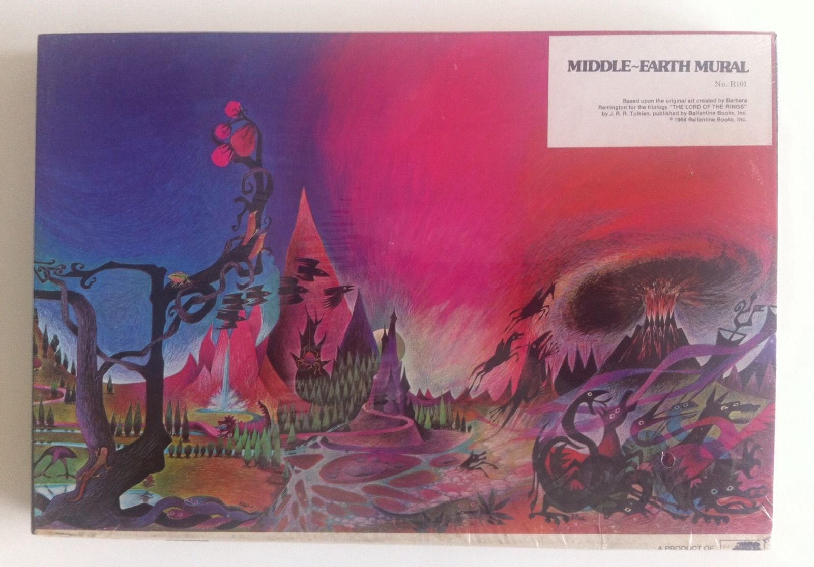 |
| Lord of the Rings | Jigsaw Puzzle via Two Warps to Neptune |
The blotter paper soaked with dramatic blue and magenta splodges of paint expressing a volatile quazi-Hendrixian purple haze, perfectly suited for expressing the contents of what is, effectively, a book about going on a very. long. trip. Remmingtons stylistic flourishes and bold painterly approach continued to have a lingering influence on fantasy art that long outlasted the grumpy outpouring of bitter disdain and reproach from Tolkien. A fact that would have no doubt annoyed him considerably.
 |
| War of the Ring | Tim Kirk | FGU | 1977 |
Tim Kirk's dramatic cover for FGU's WAR OF THE RING is obviously inspired by Remmingtons masterpiece, and skillfully employs the motif of savage Orcs bringing their putrid red stench with them wherever they travel, great steaming clouds of noxious gasses staining the sky and land, laying down some really heavy vibes. The bright clean spring air of the proud upright banners, wholesome trees and noble warriors railed against them. Meanwhile the contrasting FGU logo and the masthead create a yin-yang effect of cosmic balance.
 |
| Divine Right | Kenneth Rahman | TSR | 1979 |
The cover of TSRs tactical wargame Divine Right by "Elladan Elrohir" aka Kenneth Rahman. Mount doom spewing clotted red clouds into the sky populated by a ghostly wild hunt.
 |
| Lord of the Rings | Ralph Bakshi | 1978 |
Remmingtons rendering of the power of evil to materially distort the doors of perception and stain the world with evil was something Ralph Bakshi had played with while working on Spider-man, where the development of the psychotropic mise-en-scene as mirror of a tortured mind was no doubt partly responsible for the lurid evil kaleidoscopic effects seen in Bakshis great cinematic adaptation of The Lord of the Rings.
 |
| Mark Rothko | Untitled 'Orcs in Mordor' | 1961 | via |
It's unquestionable that Remmingtons work has had a significant and lasting impact in the genre, but eventually "Tolkien Art" gave way to various forms of naturalism, from the clean bright renderings of the Hildebrandts to the soft, misty drawings of Alan Lee.
Returning to the subject at hand, it is worth noting the Lampoons cover art of Bored of the Rings is an early work by none other than the great Micheal Frith, and it clearly displays the tongue-in-cheek mix of whimsy, subtlety, fantasy and humour that would serve him well as the Creative Director of The Jim Henson Company and as the Concept Artist responsible for the creation of Muppets such as Scred from Saturday Night Lives Land of Gorch and the frankly maddening and carefree and song-obsessed denizens of Fraggle Rock, who bare more than a little resemblance and maybe owe something of their starey-eyed madcap ways to Bored of the Rings hobbit analogues, the Boggies. In fact it's difficult not to see them as some form of distant yet annoying cousin who only ever phones to borrow money. "In a hole in the ground, there lived a Fraggle."
 | |
|
 |
| Concerning Boggies | Micheal Frith | via |
Leaving the unspeakably middle double-constonanted family tree of Hobbit, Boggie, Fraggle (and Hoggle from Labyrinth) aside, not to say, chopping the whole thing down for the sake of all our sanities, we return to the cover of The Bored of the Rings. Here we can see Frith was less following in Remmingtons esteemed footsteps than creeping up behind her with a cudgle, ready to mug every last ounce of artistic license available. Having waded through the groan inducing pun-drenched excuse for a novel, myself it's clear that Frith either, like Remmington before him, just didn't have time, or just couldn't be bothered with it or thought he had a better idea of what should have been going on. And who could blame him? It's hard to know where to begin, except to say that having a cover so profoundly divorced from the narrative contained within could only be part of a studiously wrought meta-parody - perfectly reflecting the Ballantine editions lack of fidelity to the text. Pure coincidence, or rather pure lack of coincidence, could not have missed the mark so astutely.
 |
| Toothbrush that was forged anew. |
Starting with the central visual feature of the composition, a dazzling white toothbrush emerging from a river. There is no lady of the lake dismembered arm raising an excalibur-like toothbrush from the waters scene at all. Whatsoever. At all. Unless I missed it, which is entirely possible as I'm not infallible. There are references to tooth-paste, tooth-fairies, and well, just teeth. But no Tooth brush. If you don't believe me you can go read it yourself, it's like an epic quest, but more pointless "Hunt for the Toothbrush".
 |
| C69: Pig-faced Nozdrul on Wild Boar |
The buxom sow-riding pig-woman Nozdrul is a blindingly genius concept of geniusness. It's hard to overstate the sheer cultural impact and magnitude of this perilous porcine picture. The fearsome yet saucy Nozdrul as buxom pig-lady predates the creation of the fearsome yet glamorous buxom pig-lady Miss Piggy (designed by Bonnie Erickson at the Jim Henson company) by a whole seven years. The Hildebrandt Brothers infamous but debatable Lizard Goblin Pig Orcs by the same seven years and the emergence of the archaic yey porcine Pig-Faced Orcs of Dungeons and Dragons by eight. All in all this may be the first image of an anthropomorphic pig riding a pig in all of humanoid history. Then again, it probably isn't. But it's certainly an image that joins the dots between Tolkienesque Fantasy and pig-headed humanoid-monsters.
 |
| C69: Flying Beasties |
I don't recall any giant flying black grinning hippopotamuses, or the Nozdrul taking winged flight at all, so this seems to be a reference to the original book, or Remmingtons weird crows and sky-leaping horses from her Lord of the Rings cover although the Pegasus-knight does seem to be referencing the Pirated 1965 Ace Paperback cover of The Two Towers. Remmingtons bulbous pink Christmas tree fruit also make an appearance, like a sinister art nouveaux streetlamp triffiding its way onto the page and demarcating the territory for the twisted gods of parody, even if they do not appear in the book.
 |
| Frito | Goodgulf | Nudie-elf | Arrowroot Mounted. on Sheep. |
There is something in the round-eyed stare of Frito the hobbit reminds one of the manic stare of Gobo Fraggle, an unfortunate family resemblance that suggests dubious parentage we've already dwelled on for too long, and is probably best to gloss over at this juncture. Needless to say, this is not how Frito crosses any river anywhere in the book.
The general air of wanton smuttyness returns with the rather pink elf-lady riding a sheep. No saucy elf lady rides a sheep in Bored of the Rings. There is a saucy elf lady who tries to seduce Frito into giving her his ring, but that episode itself is presented as a quote from the main story, and doesn't appear in the main story. And there aren't any sheep involved in that bit, fortunately.
Next we have the Wizard Goodgulf. Shades and a dark green speedway-rider motorcycle helmet. Perhaps coincidentally ZZ-Top formed in 1969 the fated year that Bored of the Rings was published, releasing their first sub-Led-Zepplin single - Salt Lick, but wouldn't don the sunglasses and extreme beard image they would become famous for until the late 1970s. Goodgulfs transformation from discredited rosicrucian to southern blues-rock fashion icon may have been his greatest feat of magic, but maybe not.
Arrowroot Son of Arrowshirt a somewhat ghostly pale-faced impersonation of The Lone Ranger. in his cowboy hat and fringed jacket, a gag that draws Aragorn, and Lower Middle Earth with it into a kind of cheap frontier Americana.
Finally, we see one of Tolkiens hated emus, dead at the bottom. Possibly strangled by a hookah pipe, in the library by Colonel Custard. The Letters of J.R.R. Tolkien were not published until 1981, some 11 years after Bored of the Rings, so it is doubtful that Frith got wind of Tolkiens dislike of the beast and symbolically slaughtered the bird on Tolkiens behalf. As far as I know Tolkien never read Bored of the Rings, nor passed any comment upon the novel or it's cover, but I can't help thinking he'd have been mildly gratified by the murder of this irksome antipodean intruder, if quite outraged yet incensed by the rest of it.


Those original covers were on the copies we had in the house when I grew up. Although they are obviously not related to the story, I liked their other worldly quality and I felt that they were faithful to the spirit of the story in the way that a gritty photo realistic depiction wouldn’t be.
ReplyDeleteI'd have loved to have grown up with these. I was introduced to Lord of the Rings with some very austere folk-minimlalist 1970s Allen & Unwins with just an eye in a ring and some large type, charming in their way, but Remmingtons are wonderful.
DeleteLoved those covers! They were the first editions I read, and my parents had a jigsaw puzzle of the whole triptych. Yes, nothing to do with the story, but I loved them so much that I hunted them down for myself all these years later. And Bored is pretty funny too!
ReplyDeleteI am tempted to get them myself, as they'd match my Bored of the Rings and Remingtons covers are great, but I have to question if I really have shelf space for yet another set of LoTR! Perhaps the jigsaw hmm... $250 on eBay not sure that's quite in my jigsaw-puzzle budget...
DeleteI was given this book by my parents as a Christmas or birthday gift when I was, I think, 16 or 17. I never read it. The cover looked like this:
ReplyDeletehttps://static.tvtropes.org/pmwiki/pub/images/BotR-2_3953.jpg
It's quite funny in it's own way.
DeleteThat edition is very late 70s, Hildebrandt style artwork, with Bakshi era LoTR logo (same as the one Citadel used on their ME range packaging - probably worth a quick t-shirt when I get round to it). So while the cover is on point as parody, the book is still full of 1960s references, not late 70s-early-80s references. The <a href="https://twitter.com/ZhuBajiee/status/1063154432253276165>8-bit computer game</a> is much better in that regard...
Fordo Fat Fingers typed the link wrong: 8-bit computer game
DeleteThe misleading cover could have been part of the overall plan. Witness the flyleaf teaser ("Do you like what you dost see?") which bears the same relationship to the novel. Frith seems to have been part of the Lampoon crowd, and may have even shown up in NatLamp. Anyway, I'd be remiss if I didn't mention that I liked your take on things, which I found while looking for something else that I'll forget if I don't get back right away to that thing that it, eh, is. I second the call for footnotes. I read this pretty soon after it came out, but I didn't get Garfinckel's because I lived in Colorado.
ReplyDeleteI agree, the cover was totally intentional and part of the joke. Frith was head of the Harvard Lampoon, and designed the Muppets for the Land of Gorch sketches on Saturday Night Live, where many of the National Lampoon writers ended up. I don't know if any of his drawings appear in National Lampoon, probably too busy working with Dr. Seuss and Jim Henson by then.
DeleteYeah, a slightly tongue in cheek scholarly edition - like a parody of the History of Middle Earth books, with notes on Doug and Henrys drafts and biographical information would be amazing.
According to "Mark's Very Large National Lampoon Site," Frith was a contributing editor, 1970–2. I didn't know he was on the masthead.
ReplyDeleteThe thing I remember was a double-crostic "puzzle" (quote marks because the gag was that each clue simply went into the designated blanks with no thinking required) which bore two names, one of them "Frith." I was looking for that when I stumbled upon the editor credit.
After some googling, it's starting to look like the only way I'll find the puzzle I recall seeing (I'll guess around '72) is to look at every issue I have page by page, and it's not rainy out, so sod that.
I've spotted Friths name on a couple of architectural led pieces on Buckminster Fuller and alternative energy, but cant off hand spot anything that looks like his muppet design work or BoTR cover.
DeleteLike the first couple of commenters, I also grew up with a set of that Remmington edition around. Altho we had another, later, hardback edition that was mostly what we read, because even at that point in the 80's the Ballantine copies were pretty fragile, and have since completely fallen apart. Wish I'd thought to save the covers, tho. I always did love that artwork.
ReplyDelete