The cover, illustrated by Gary Chalk, most famous for Talisman, Lone Wolf and Redwall. sets a suitably grim and gritty tone.
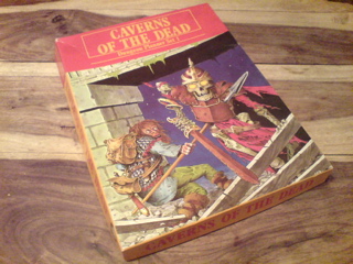 |
The box, cover illustration by Gary Chalk, which is repeated on the 'DM Screen'
|
The DM screen repeats the box cover artwork and has a history of the Royal Tombs on the outside, a few encounter tables and a map of the floor plans with a key. The encounter tables are split into 3 themes in-use, neglected and abandoned - each giving a different flavour of dungeon, in-use being guarded and populated by pilgrims and priests, neglected being with a few guards, wild animals and goblinoids, and abandoned with the tombs having been overtaken by high powered undead. Along-side the staple dungeon-dwellers such as orcs and hobgoblins, several of the creature suggestions; Goat Headed Ogres and Night Elves betray the influence of First Edition Warhammer Fantasy Battle and early Citadel Miniatures. The AD&D specific Kobolds also appear in a wandering monster chart. Like the location booklet, no statistics are given for these creatures, the reason being to make the game 'systemless', which as a sales-pitch sounds really liberating, but in reality just means there aren't any stats.
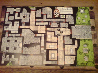 |
The giant size floorplan. Miniatures not included, for scale reference only.
|
The main event is the floorplans themselves, a huge folded sheet (810mm 550mm approx A1) of nominally 25mm floorplans, where 1 square (0.75") = 5ft. This is the same scale as Games Workshops Dungeon Floorplans series (on inspection it looks like it has been constructed out of them). Incidentally the floorplans in GWs edition of MERP (a Tavern and a Troll Cave) and their Warhammer campaign McDeath (a Castle) are the same scale. Modern figures do look a little cramped on the plans. The plans themselves are essentially black line work over flat-colours to denote area - grey small stones for some rooms, buff stone slabs for others, green for outside, brown for doors. These are clear graphical floor-plans, not a card-stock model of a dungeon, there's no fancy lighting effects or other illusionistic features.
As a piece of dungeon architecture, The Royal Tombs belongs firmly in the "fill the page" school. The structure itself seems to lack strategic coherence - the main entrance is protected by guard-rooms with windows looking out into the main corridor, but no doors, meaning any guards stationed there would have to make a long trek before attempting to stop whatever is coming in or out, whereas the secondary entrance is clearly the more defensible position, with shorter guard routes and more windows for missile cover. Putting such minor quibbles aside, there are a good number of varying sized rooms and different features, such as the tombs themselves an abyss, rock-falls and the inevitable latrines.
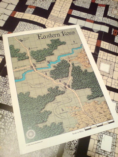 |
Eastern Koss, the area surrounding the Royal Tombs
|
Also in the box is a 200mm * 280mm (just under A4) area map of Eastern Koss this is a handsome enough map - like the floorplans, it is black line work over flat colour - in the archetypal typical little mountains and trees fantasy map style. As a landscape it's reasonably logical with rivers in valleys and woodland distributed. the inhabited locations are of different sizes and there. The bridge-town Windrush shares it's name with the ship famous for bringing British Caribbeans to England in 1948, a less historically significant name would have helped kept the illusion of a coherent fantasy world, but this is a minor quibble, and perhaps a little anachronism feeds the imagination. The map also features several menhir of mysterious unnamed purpose, but again these could be used to help build a series of adventures around them and develop a campaign outside the tomb itself.
This all leaves us with the largest problem of this product. Who is supposed to use it, and how? Most DMs worth their salt can take a fully populated module and adapt it to their campaign, while here we are given the 'fluffy' background parts of a module and expected to do all the hard work in terms of populating it with monsters treasures and npcs.
Perhaps the greatest weakness as a product is the issue of re-usability. A DM can't seriously keep pulling out the Caverns of the Dead floorplans and using them as a different dungeon location every session, one time the Ogre Kings Lair, next session the Elven Halls then the Goblin Caves.
The Dungeon Planner series are intended to be half finished, waiting for the godlike hand of the DM to come and bring the place to life, but instead of fuelling the creative urges, it just comes across as being a little half baked, rushed and a bit lazy. If this had been a fully developed game, packaged up with a simple combat and action resolution system, card-stock monsters, characters, and a campaign guide, this could have been the start of a fantastic product line (like the much later GW/MB Heroquest), and creative DMs could still easily adapt the materials to their campaign. The Caverns of the Dead usefulness to the DM as a starting point for a campaign is just as limited as any standard adventure module, but without the benefits of being able to simply run it as an adventure straight out of the box.
Of course, all of that is secondary, what DPS1: Caverns of the Dead, does and does well is supply a really great set of old-school feel, 25mm dungeon floor-plans.
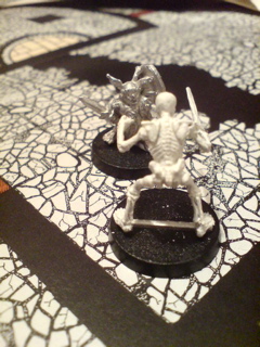 |
| A halfling (Citadel ME34 Pippin) takes on the undead (Otherworld UD1a Skeleton) |
This review was first posted on Dragonsfoot, like, years ago.


No comments:
Post a Comment