Saturday, 17 November 2018

Furui Hanmā: The Kappa Sha Wujing Side Trek


This step in our ongoing series exploring the Far Eastern lands of Warhammer, is a bit of a departure, as it's not really about any form of Warhammer at all.  What it is about is Nippon TVs 1978 adaptation of Wu Ch'eng-en great Chinese story Monkey one of the Four Great Classical Novels of Chinese Literature.

Sha Wujing or Sandy as he is known in the TV series. Here's a quick sketch of Sandy, I've added a backpack, pouch and gourd to make him look a little more like a typical overburdened Dungeons & Dragons adventurer.

Sha Wujing / Sandy Rough Sketch [ZHU]18
For those unfamiliar with the story of Monkey, Sha Wujing or "Sandy" was one of the Heavenly court who was thrown out of heaven for breaking the Emperors Jade Cup, which like opening Pandoras box, unleashed all the troubles into the world.  As punishment, Sandy was sent to earth to live as a canibalistic water spirit (he wears the skulls of nine buddhist monks he has eaten around his neck) and eventually he  joins the holy prilgrim Tripitaka on his quest to retrieve the scrolls of Buddism from India to teach Buddism to the Chinese and releave them all from suffering of the world. One of the main themes of Sandy is the tension between action and inaction, of interfering in the world and philosophically nullifying ones existance through over-thinking, option paralysis and apathy. Of course, he isn't entirely overcome by his overly-pretentious philosophical moods and also carries a Monks (or Shaolin) Spade, with it's broad axe head, and crecent moon - supposedly used for dog-handling, which he uses to bash the various  demon-monster-spirits determined to prevent Tripitaka from completing his quest.

It should be clear that Sandy is a monster, a cannibal, who nontheless becomes a hero in the story by trying to overcome his monstrous nature, as is true of the other pilgrims - Monkey, Pigsy and Tripitaka (although his monstrous adherence to principle over practicality, is not so easy to discern). It is also easily observed that most of the demon-monster-spirits that Tripitaka and his entourage encounter are aspects of human nature exaggerated to monstrous, demonic form, but who nonetheless, are all souls on the path of Karma heading towards enlightenment. The lazily simplistic 'good vs. evil' or 'us-vs-them' tropes found in modern western fantasy depictions of monsters such as Orcs and Chaos Ratmen as Other (often based on historical cultural racism and bigotry) in  media are quite absent, and there is something to be learned there, not only in dealing with some of the more problematic ideas in Western Fantasy, but also in structuring an approach to Oriental Adventures that doesn't simply reproduce the tropes of Western Fantasy in Oriental drag.

Anyway, let's have a look at how Sha Wujing is traditionally portrayed:

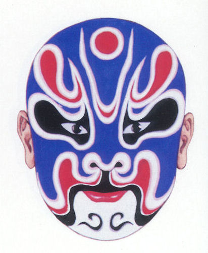
Sha Wujing | Bejing Opera
Sha Wujing | Beijing Opera Mask

Sha Wujing | Bejing Opera Maks | Cigarette Card

Sha Wujing in Xiyou yuanzhi (西遊原旨) 1819.

Sha Wujing, a blue faced, heavily bearded monk. Here's a friendly reminder of how Sha Wujing as Sandy is portrayed in Monkey.


Sha Wujing | Sandy |  Shiro Kishibe
It should be reasonably obvious that the 1970s Nippon TV character design of Sandy bears very little to no resemblance to traditional Chinese depictions of Sha Wujing, and most of Sandys notable features, such as the peaked hair-style and hat have no basis in traditional Chinese imagery at all. So what is going on here, why is the Nippon TV character nothing like the traditional version od Sha Wujing?

Well, I think the answer appears to be in the Japanese Oni known as Kappa.

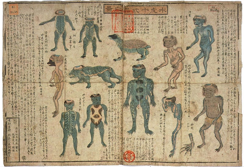
Japanese Kappa with a cucumber
Kappa from
Gazu Hyakki Yagyō ("The Illustrated Night Parade of a Hundred Demons") by Toriyama Sekien
Kappa Kappa

These mysterious and strange turtle-people are, like Sandy, canibalistic water creatures.

  • the over-all dark green colour, 
  • the fringe creating a visual 'beak' 
  • bald head, which is covered with a dish-hat 

Kappas head-bowl must contain water, and if it dries out they die. In the TV series Monkey very often the four Pilgrims run out of water, and Sandy, rather than drinking it, takes his bowl-hat off and splashes it on his bald pate, much to the comedic annoyance of his brethren.

Kappa are known to lead horses to drown, indeed one of the many names of the Kappa is Komahiki or "steed-puller". If so,  this is played up as something of a joke in Monkey - Sandy is most often the one seen leading Horse by the reigns - who is herself (or himself, in the second series of Monkey ) is actually a water-dragon, a river-spirit transformed into a Horse.

Kappa pull ones shiridama (or bum-ball, an imaginary internal organ) out of peoples bum-holes. This doesn't seem to have influenced Sandy, but maybe there are some bum jokes I missed. Also, on the subject, Arthur Waley's abridged translation of Wu Cheng'ens  Monkey, does contain much of the crude, frenetic energy and boisterous humour of Monkey, it's a folk-tale infused with humour culture and philosophy, not a dry studious work. Unfortunately Sandy isn't in it much, which probably suits him quite well.

Sandy | Jamie Hewlett

Of course, Sandy isn't by any means the only example of japanocentric re-visioning of other cultures. We can think of Akira Kurosawa's Throne of Blood (1957) - a retelling of William Shakespeare's McBeth transporting it to feudal Japan.


And we can also see below a illustration of George Washington fighting the British by Utagawa Yoshitora. While George himself is rendered as a Japanese gentleman with 19th Century western clothing and armaments,  probably the most striking element is that the British are dark skinned. Perhaps based on the illustrator hearing some anecdotes of Black British fighting in the American Civil War on the English side, but more likely to represent the British as Oni - a mythological rendering of that signifies sympathy with Washingtons cause than his adversaries. Putting aside the problematic Japano-African racism that gets thrown here, a mainly folk-mythological reading is supported not only by the large number of mythological and folkloric figures - dragons, giant eagles, that Washington fights off - but also apparently by the British Officer being named Asura - the sanskrit name for the buddhist-hindu kind of stubborn wicked demon-monster-spirits who will not change their ways...


George Washington fighting the British | Utagawa Yoshitora | 1861| via
To return to Sha Wujeng - what we're seeing in NHK/Nippon TV series is a Classical Chinese work and filtered it through Japanese folkloric as a kind of "Interpretatio Graeca" - the ancient Greek practice of polytheistic syncretism - seeing other pagan gods as the same your own (so Amon / Zeus / Odin for example) - which when recognising the different tropes, underpins thinking of comparative mythology and in its creative expression - as we see with Monkey - keeps  a living, mythology that grows and adapts as it encounters other cultures, rather than a static text bound to a specific time and place.  When considering Orientalism in the context of fantasy. there is a strong case for rejecting of the idea of a strict, po-faced idea of 'cultural authenticity' as being less actually authentic to the creative practices of Oriental cultures, than a strategy that embraces complexity and cultural interchange in a more playful, emphatic way.

Wednesday, 7 November 2018

Greatest Battle Report 2018: Nominations Open

Welcome back to the second annual Greatest Battle Report Awards!

The Greatest Battle Report 2018

After the success of the first Greatest Battle Report Award in 2017, I've decided to organise another one for this year. The format is much the same, but have introduced a few innovations in the process that I hope will encourage more entries and more visibility for the Nominations.

Stage 1: Nominations

Nominate a Battle Report - for any tabletop, miniatures gaming system, as the Greatest Battle Report of 2018. We're looking for anything and everything great in the world of Wargaming and Tabletop Miniatures, perhaps it has a great narrative, perhaps the table layout and photography was stunning, perhaps the models were just really cool, perhaps the improvisation and counts-as thinking reached genius level, or maybe everyone playing had a really great time and the love for The Hobby™ shines through. Whatever you think makes for a Great Battle Report - that's what we want to see nominated.

If you want some idea of the amazing efforts gamers go to in creating their Battle Reports, feel free to view last years nominations, and last years glorious winner  Pitch Invasion by Nico.

You can easily nominate a Battle Report by a number of ways of doing that:
  • Post a link on twitter using the hashtag #BatRep18 
  • Post on the thread on The Oldhammer Forum
  • Leave a comment to this blogpost
  • Email  Zhu with the subject line "BatRep18 Nomination"
The Battle Report must be publicly accessible. Nominations for Battle Reports behind paywalls, on register-to-view sites or published in magazines or commercial wargaming companies websites will be discarded. The Battle Report must have been published in 2018. All nominated entries will be listed in a blogpost on this website.

Self-nominations are allowed, and in fact encouraged! If you nominate a third party Battle Report, and not your own, please notify the author in some way (comment on the blogpost) that they have been nominated for The Greatest Battle Report of 2018. Feel free to link to this post by way of explanation, but it is by no means a requirement.

In 2017 we had 10 Nominations, which was a great response and an easy number to deal with.  Should we have more than 12 Battle Reports Nominated in 2018, these will be shortlisted to a maximum of 12, on a first-come, first served basis. The closing date for Nominations will be  30th November 2018, so get your nominations in quick!

Stage 2: Voting

Voting will probably be by SurveyMonkey, starting around 1st of December, running to 31st December 2018.

The aim of the Greatest Battle Report is to spread the word, and get more people to read the many great Battle Reports that are out there, so once Voting is under way, it is critical to get as many people to vote as possible, motivate your base and mobilise your clamouring cult of followers to vote for you.

Stage 3: The Award

The Greatest Battle Report remains a stubbornly fannish affair, curated and voted for by the community. Everybody wins because everybody gets to read great Battle Reports they might have otherwise overlooked.

The reward for coming first place and being crowned The Greatest Battle Report 2018 is to bask in the admiration of your peers, and know that your creative endeavours have been recognised as a example of hobby gaming. You can also display "The Greatest Battle Report 2018" banner alongside your blog to honour the recognition your Battle Report has received - although of course this is entirely optional.


Let the well documented, entertainingly written and presented battle commence!

Friday, 26 October 2018

Bored of the Rings

The History of Lower Middle Earth: Part One

"Don't judge a book by it's cover" goes the old cliche trotted out to denigrate the fine and exacting work carried out by illustrators and book jacket designers the world over. But no, book jackets are important. Not only do book covers serve as marketing tools to entice hapless saps to pick-up some half-baked tome of drivel off the creaking shelves of their local black-windowed publications emporium, they also serve as a flag of social stigma and embarrassment should one undertake the social faux-pas of carrying or worse, actually reading a book conspicuously in public. This, of course, explains the popularity of e-book readers. It's not the convenience of carrying 40,000 digital documents in your pocket, which is quite pointless as none of them appear to have that exact recipe for mixing the perfect Pan Galactic Gargle-Blaster that you're looking for when you need it.

I could really do with one of these about now | via

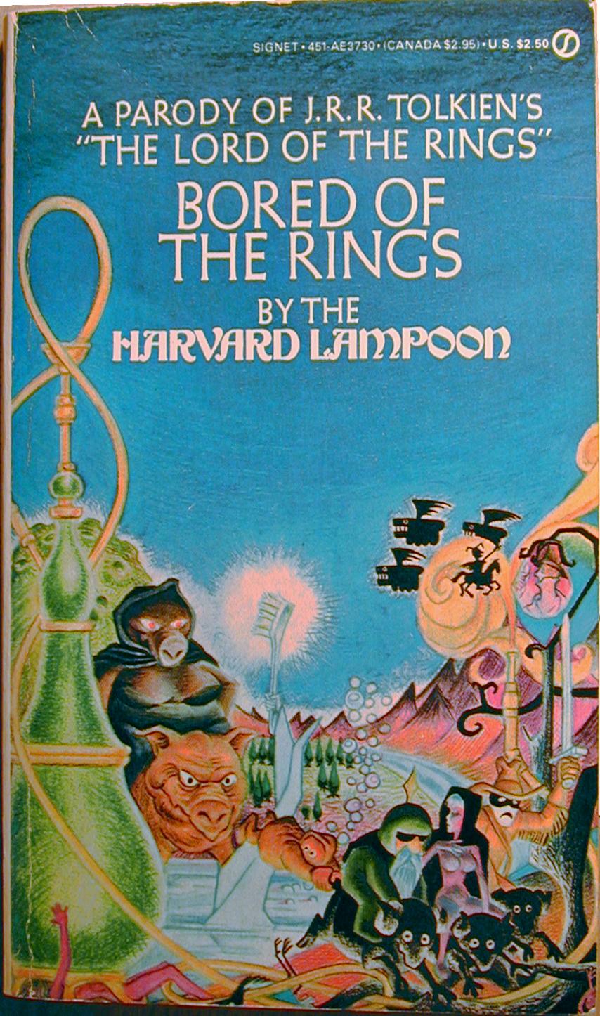
No, the real value of polymorphing books into anonymous grey plastic rectangles is that one can sit in a coffeeshop in Rickmansworth sipping a skinny latte or stand on public transport on the commute to work whilst reading Shifty Shapes of Grey without the risk of anyone batting an eyelid, and avoid being even slightly embarrassed about peering at the grimey print hidden behind the glossily airbrushed homoerotic thews of Gonad the Barbarian, or being pelted with rotten fruit for reading the XXVII tome in the Horribillis Hearsay of the Grimdank Universe series. Or indeed, avoid entirely the intense social stigma and certain ridicule that comes from wielding a mini-placard embellished with the hookah-pipe and mighty bosom of a militant mutant sow riding pig lady and curvaceous elf girl astride  a black ram emblazoned upon on The Harvard Lampoons Parody of J.R.R. Tolkien's "The Lord of the Rings":  Bored of the Rings that announces loud and proud your lack of literary discernment and pervy stoner nerd credentials.

Bored of the Rings | Michael K. Frith | 1969

Considered in isolation, the cover of the Signet first edition of Bored of the Rings is a thing of finely crafted wondrous beauty. The composition is harmoniously balanced, rendered in jewel-like colours and with  montage reflecting oneric, fantastical vision, oozing with quirky detail and charm. The combination of visual splendour, simple messaging and dubious sexual content make it a near platonic ideal of the most effective persuasion technologies of the commercial arts of Madison Avenue.  But before we indulge ourselves by observing the contents of the cover in  Bored of the Rings in minute yet pedantic detail, it behoves us to turn our baleful eye towards the first American paperback edition of The Hobbit published by Ballentine in 1965.

The Hobbit | 1965

Upon observing this exquisitely wrought jewel of mid 60's pop-psychedelia, the author of the book had this to say (with moderation) on the matter:
I wrote to [his American publishers] expressing (with moderation) my dislike of the cover for [the Ballantine edition of ] The Hobbit. It was a short hasty note by hand, without a copy, but it was to this effect: I think the cover ugly; but I recognize that a main object of a paperback cover is to attract purchasers, and I suppose that you are better judges of what is attractive in USA than I am. I therefore will not enter into a debate about taste – (meaning though I did not say so: horrible colours and foul lettering) – but I must ask this about the vignette: what has it got to do with the story? Where is this place? Why a lion and emus? And what is the thing in the foreground with pink bulbs? I do not understand how anybody who had read the tale (I hope you are one) could think such a picture would please the author. ... 
...When I made the above points again, her voice rose several tones and she cried: 'But the man hadn't TIME to read the book!' (As if that settled it. A few minutes conversation with the 'man', and a glance at the American edition's pictures should have been sufficient.) With regard to the pink bulbs she said as if to one of complete obtusity: 'they are meant to suggest a Christmas Tree'. Why is such a woman let loose? I begin to feel that I am shut up in a madhouse. 
J.R.R. Tolkien Letter to Stanley Unwin 1965 


The Hobbit cover, and the many obtuse excuses used to cover it, was only the beginning of Tolkien being psychologically terrorised by his time-poor, gender confused and cash hungry American publishers. The disliked vignette itself was taken from the left hand side of yet even more grander vista in a painting by Barbara Remington - a woman of the female persuasion, and not as Tolkiens mind-game playing American agent insisted, a male of masculine orientation. Why, as Tolkien asks, are such women let loose? Who knows, perhaps they are simply sent to torment bookish old professorial elf-fanciers of Oxford, but perhaps because in their lack of time, like a Hobbit scrabbling at answers for riddles in their nastly little pocketses, true genius finds its way up, out of the subconscious darkness of the Goblin Mines, out through the dark and twisted passages and past the secret doors, up and into the light of the world.

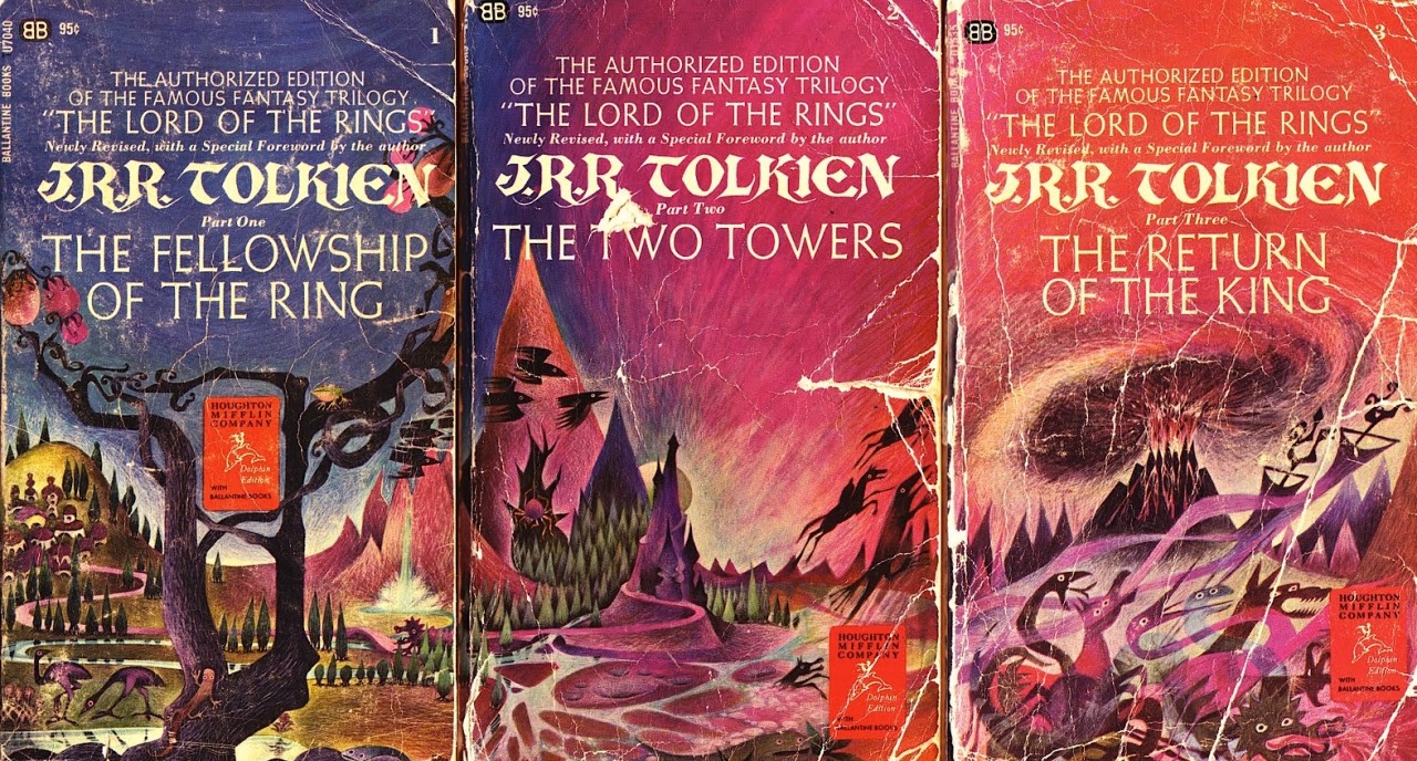
Indeed, the vignette for The Hobbit was but a prelude to the unveiling to the world of the epic triptych which would be the 1965 Ballentine edition of Tolkiens Lord of the Rings trilogy of books. If the lion and emus and bulbous fruit of The Hobbit had managed to summon such disgruntled bile from the Professor who knows what words of scorn and derision the flying horses and piles of snakes may have spurted forth from the raging nib of his enraged and bitter quill. 

Barbera Remington | Lord of the Rings | 1965
The attention to detail in Harvard Lampoons parody of Remingtons Lord of the Rings cover is second to none.  Not only is the illustration style, colour and tone a dead match, the typography perfectly errs on the correct side of a hugely expensive and drawn out copyright dispute and outright plagiarism.  The book titles are rendered rather plainly and quite handsomely in Goudy Sans, offering an austere yet organic, anti-industrialism echoing the hand-lettered rather than mechanical and authors name in rather florid psychedelic-age redrawing of William Morrises Troy lettering, itself something of a victorian revival of medieval insular calligraphy. Tolkien being a massive fan of Morris should have approved somewhat, but instead, alas, cried 'foul'.

It is clear that whole cover of Bored of the Rings has been near fraudulently designed to entice a mushroom-stuffed hippy student of the early1970s to fumblingly pick it up from the rickety wire carousel of paperbacks on the newspaper stand while buying a pouch of Longbottom Leaf and some cigarette papers  and hand over the loot to the newspaper vendor (played, for some reason, by Richard Prior) without noticing they'd been hoodwinked before it was too late.

As well as setting up the books persistent self-referential gags about being a crass attempt to cash in on the commercial success of Lord of the Rings,  the aping of the Ballentine first authorised edition of The Lord of the Rings cover design serves to tie Bored of the Rings to that very specific time and place, one single Thursday afternoon in the America as the sun slowly set on the 1960s. Nixon was in the Whitehouse, Students were taking over Harvard University, moon landings were on the horizon (of the moon, presumably, but maybe the Nevada desert, who really knows, maaan?), the Manson Family were planning to unleash Helter Skelter upon the West Coast and Bryan Adams was standing on yo mommas porch. Yes, it was the Summer of 69. Ahem ahem.

Bored of the Rings is very much an artifact of those ancient days and is as much about the late sixties or early seventies America as it is about The Lord of The Rings. Besides being a parody of Tolkien work, the novel is riddled with puns and references that mean absolutely nothing to a contemporary reader, many of which have sank so far deep into the collective unconscious as to be completely unrecoverable except by all but the most determined delver of cultural detritus. One such unponderable reference,  Garfinckel, an elf, named for a department store chain that went bankrupt in the 1990s. The contemporary publishers conceit of updating the books cover to reflect the visual language of more recent movie adaptations, while keeping the tongue-in-cheek mercantile humour, lose much of the specificity of the text. Other non-movie tie-in covers attempt to position the book as generic comedic fantasy, glossing over the precise context. What the book really needs in 2018 is not an updated cover, but a critical edition with endless footnotes and meandering commentary that firmly establishes the historical context while explaining the referential jokes for the undereducated and elucidating upon the long lasting legacy of the esteemed work.

The Harvard Lampoon was itself an grotesque overblown student magazine reinvented by Doug Kenny and Henry Beard that served as an exclusive, gentrified breeding pit for their peculiar class of  self-indulgent comedian whose natural habitat - the publishing niche that occupies the cocaine filled valley that lays between the great stone Argonath of Hugh Hefner and Alfred E. Neumann - was about to spill out of the gates of Harvard and take their Lampooning on to a National stage, as the National Lampoon, then promptly set off on the epic quest across strange yet bewildering landscapes of myth that is Vacation with Chevvy Chase. But while all that was in the far future of 1983, which is now the dim and distant past on 1983, the spectre of fantasy genre parody never quite left the Lampoon frat-house.

Conan the Barbarian - Frazetta

The National Lampoons Vacation - Boris Vallejo

It is at about this point when writing an article, when it is traditional for the Scribes of Zhu go off on a third pointless tangent, weaving the text into a kind of pseudo-intellectual equivalent of a bunch of dozey Boggies poking aimlessly at some suspicious looking fungi in their back garden when they said they were going to take the recycling bin out to the Dark Lands beyond Bakdôr. This is usually because the aforementioned scribes have got completely bored with the original subject, but also to pad out the post with as much verbiage as possible in the vain hope that the reader is distracted by the advertisements on the right hand side of the website and decide to buy an Oldhammer T-shirt or maybe some Dungeon Floorplans. And this article will prove, regrettably, no different.

Hobbit Poster via Two Warps to Neptune


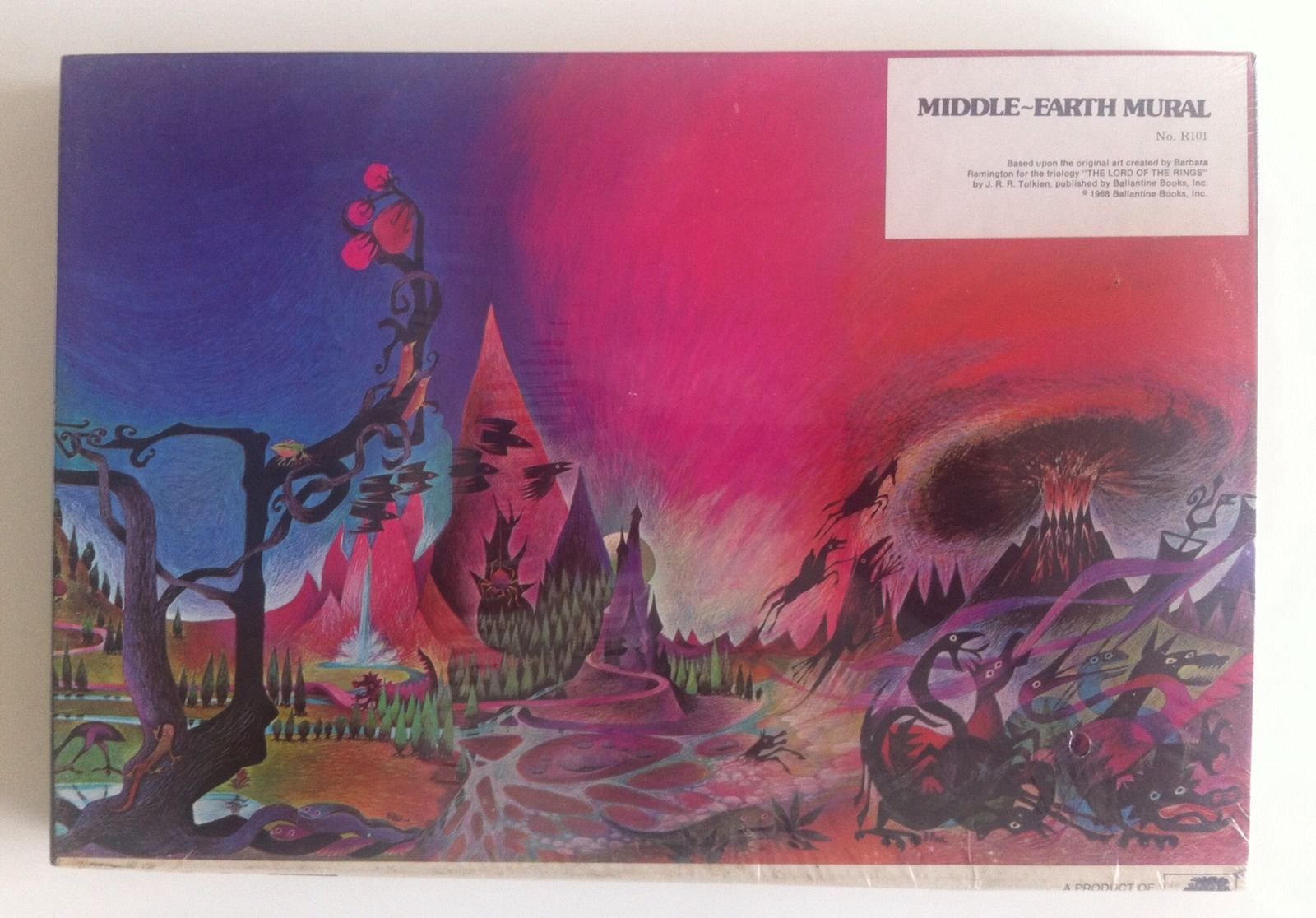
Unfortunately Barbera Remington's paintings for the covers of The Hobbit and The Lord of the Rings gives us the perfect, but also ideal, material for just such a meandering diversion. Having already discussed at inordinate and mind-numbing length the vicereal physical response by the esteemed yet grouchy author of the original book to the artwork, and its profound yet significant influence on the cover of Bored of the Rings  it is perhaps not too far fetched to examine the legacy of this maligned work of genius beyond the confines and out into the wide world beyond the paperbacked borders, and into the nefarious realm of knock-off-publishing and authorised fully-licenced merchandising tie-ins that is the sordid yet mysterious world of Fantasy Gaming.


Lord of the Rings | Jigsaw Puzzle via Two Warps to Neptune

The blotter paper soaked with dramatic blue and magenta splodges of paint expressing a volatile quazi-Hendrixian purple haze, perfectly suited for expressing the contents of what is, effectively, a book about going on a very. long. trip. Remmingtons stylistic flourishes and bold painterly approach continued to have a lingering influence on fantasy art that long outlasted the grumpy outpouring of bitter disdain and reproach from Tolkien. A fact that would have no doubt annoyed him considerably.

War of the Ring | Tim Kirk | FGU | 1977

Tim Kirk's dramatic cover for FGU's WAR OF THE RING is obviously inspired by Remmingtons masterpiece, and skillfully employs the motif of savage Orcs bringing their putrid red stench with them wherever they travel, great steaming clouds of noxious gasses staining the sky and land, laying down some really heavy vibes. The bright clean spring air of the proud upright banners, wholesome trees and noble warriors railed against them. Meanwhile the contrasting FGU logo and the masthead create a yin-yang effect of cosmic balance.

Divine Right | Kenneth Rahman | TSR | 1979

The cover of TSRs tactical wargame Divine Right by "Elladan Elrohir" aka Kenneth Rahman. Mount doom spewing clotted red clouds into the sky populated by a ghostly wild hunt. 

 Lord of the Rings | Ralph Bakshi | 1978

Remmingtons rendering of the power of evil to materially distort the doors of perception and stain the world with evil was something Ralph Bakshi had played with while working on Spider-man, where the  development of the psychotropic mise-en-scene as mirror of a tortured mind was no doubt partly responsible for the lurid evil kaleidoscopic effects seen in Bakshis great cinematic adaptation of The Lord of the Rings.

Mark Rothko | Untitled 'Orcs in Mordor'  | 1961 | via


It's unquestionable that Remmingtons work has had a significant and lasting impact in the genre, but eventually "Tolkien Art" gave way to various forms of naturalism, from the clean bright renderings of the Hildebrandts to the soft, misty drawings of Alan Lee.

Returning to the subject at hand, it is worth noting the Lampoons cover art of Bored of the Rings is an early work by none other than the great Micheal Frith, and it clearly displays the tongue-in-cheek mix of whimsy, subtlety, fantasy and humour that would serve him well as the Creative Director of The Jim Henson Company and as the Concept Artist responsible for the creation of  Muppets such as Scred from Saturday Night Lives Land of Gorch and the frankly maddening and carefree and song-obsessed denizens of Fraggle Rock, who bare more than a little resemblance and maybe owe something of their starey-eyed madcap ways to Bored of the Rings hobbit analogues, the Boggies. In fact it's difficult not to see them as some form of distant yet annoying cousin who only ever phones to borrow money. "In a hole in the ground, there lived a Fraggle."

Look Ma, I caught a Boggie
Micheal Frith with Spam, Frito and Lavalier from the big screen adaptation


Concerning Boggies | Micheal Frith | via


Leaving the unspeakably middle double-constonanted family tree of Hobbit, Boggie, Fraggle (and Hoggle from Labyrinth) aside, not to say, chopping the whole thing down for the sake of all our sanities, we return to the cover of The Bored of the Rings. Here we can see Frith was less following in Remmingtons  esteemed footsteps than creeping up behind her with a cudgle, ready to mug every last ounce of artistic license available. Having waded through the groan inducing pun-drenched excuse for a novel, myself it's clear that Frith either, like Remmington before him, just didn't have time, or just couldn't be bothered with it or thought he had a better idea of what should have been going on. And who could blame him? It's hard to know where to begin, except to say that having a cover so profoundly divorced from the narrative contained within could only be part of a studiously wrought meta-parody - perfectly reflecting the Ballantine editions lack of fidelity to the text. Pure coincidence, or rather pure lack of coincidence, could not have missed the mark so astutely.


Toothbrush that was forged anew.

Starting with the central visual feature of the composition, a dazzling white toothbrush emerging from a river. There is no lady of the lake dismembered arm raising an excalibur-like toothbrush from the waters scene at all. Whatsoever. At all. Unless I missed it, which is entirely possible as I'm not infallible. There are references to tooth-paste, tooth-fairies, and well, just teeth. But no Tooth brush.  If you don't believe me you can go read it yourself, it's like an epic quest, but more pointless "Hunt for the Toothbrush"


C69: Pig-faced Nozdrul on Wild Boar

The Nozdrul - evil servants of Sorhed only dress up in lady pig costumes while they are in disguise in the sordid and provincial village of Whee, but not riding around the country-side on the back of giant pigs, which they do all the time. I suppose this shows Frith had made some acquaintance with the text, but really either didn't care about the basics or couldn't pass up the opportunity to paint a pig riding pig.

The buxom sow-riding pig-woman Nozdrul is a blindingly genius concept of geniusness.  It's hard to overstate the sheer cultural impact and magnitude of this perilous porcine picture. The fearsome yet saucy Nozdrul as buxom pig-lady predates the creation of the fearsome yet glamorous buxom pig-lady Miss Piggy (designed by Bonnie Erickson at the Jim Henson company) by a whole seven years. The Hildebrandt Brothers infamous but debatable Lizard Goblin Pig Orcs by the same seven years and the emergence of the archaic yey porcine  Pig-Faced Orcs of Dungeons and Dragons by eight. All in all this may be the first image of an anthropomorphic pig riding a pig in all of humanoid history. Then again, it probably isn't. But it's certainly an image that joins the dots between Tolkienesque Fantasy and pig-headed humanoid-monsters.


C69: Flying Beasties

I don't recall any giant flying black grinning hippopotamuses, or the Nozdrul  taking winged flight at all, so this seems to be a reference to the original book, or Remmingtons weird crows and sky-leaping horses from her Lord of the Rings cover although the Pegasus-knight does seem to be referencing the Pirated 1965 Ace Paperback cover of The Two Towers. Remmingtons bulbous pink Christmas tree fruit also make an appearance, like a sinister art nouveaux streetlamp triffiding its way onto the page and demarcating the territory for the twisted gods of parody, even if they do not appear in the book.

Frito | Goodgulf | Nudie-elf | Arrowroot
Mounted. on Sheep.

There is something in the round-eyed stare of Frito the hobbit reminds one of the manic stare of Gobo Fraggle, an unfortunate family resemblance that suggests dubious parentage we've already dwelled on for too long, and is probably best to gloss over at this juncture. Needless to say, this is not how Frito crosses any river anywhere in the book.

The general air of wanton smuttyness returns with the rather pink elf-lady riding a sheep. No saucy elf lady rides a sheep in Bored of the Rings. There is a saucy elf lady who tries to seduce Frito into giving her his ring, but that episode itself is presented as a quote from the main story, and doesn't appear in the main story. And there aren't any sheep involved in that bit, fortunately.

Next we have the Wizard Goodgulf. Shades and a dark green speedway-rider motorcycle helmet. Perhaps coincidentally ZZ-Top formed in 1969 the fated year that Bored of the Rings was published, releasing their first sub-Led-Zepplin single - Salt Lick, but wouldn't don the sunglasses and extreme beard image they would become famous for until the late 1970s. Goodgulfs transformation from discredited rosicrucian to southern blues-rock fashion icon may have been his greatest feat of magic, but maybe not. 

Arrowroot Son of Arrowshirt a somewhat ghostly pale-faced impersonation of The Lone Ranger. in his cowboy hat and fringed jacket, a gag that draws Aragorn, and Lower Middle Earth with it into a kind of cheap frontier Americana.

Finally, we see one of Tolkiens hated emus, dead at the bottom. Possibly strangled by a hookah pipe, in the library by Colonel Custard.  The Letters of J.R.R. Tolkien  were not published until 1981, some 11 years after Bored of the Rings, so it is doubtful that Frith got wind of Tolkiens dislike of the beast and symbolically slaughtered the bird on Tolkiens behalf. As far as I know Tolkien never read Bored of the Rings, nor passed any comment upon the novel or it's cover, but I can't help thinking he'd have been mildly gratified by the murder of this irksome antipodean intruder, if quite outraged yet incensed by the rest of it.