Showing posts sorted by relevance for query Lord of the Rings. Sort by date Show all posts

Friday, 26 October 2018

Bored of the Rings

The History of Lower Middle Earth: Part One

"Don't judge a book by it's cover" goes the old cliche trotted out to denigrate the fine and exacting work carried out by illustrators and book jacket designers the world over. But no, book jackets are important. Not only do book covers serve as marketing tools to entice hapless saps to pick-up some half-baked tome of drivel off the creaking shelves of their local black-windowed publications emporium, they also serve as a flag of social stigma and embarrassment should one undertake the social faux-pas of carrying or worse, actually reading a book conspicuously in public. This, of course, explains the popularity of e-book readers. It's not the convenience of carrying 40,000 digital documents in your pocket, which is quite pointless as none of them appear to have that exact recipe for mixing the perfect Pan Galactic Gargle-Blaster that you're looking for when you need it.

I could really do with one of these about now | via

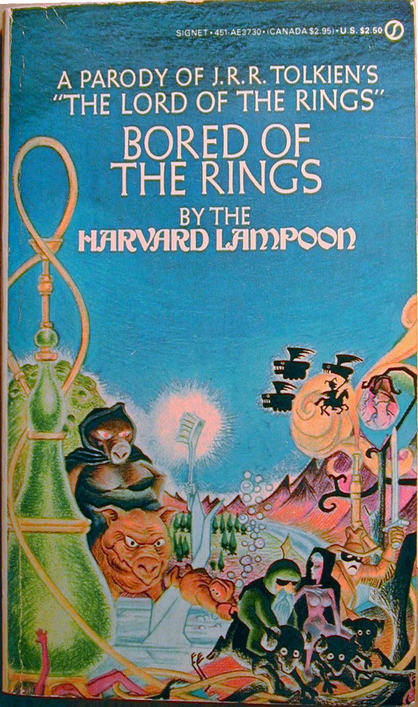
No, the real value of polymorphing books into anonymous grey plastic rectangles is that one can sit in a coffeeshop in Rickmansworth sipping a skinny latte or stand on public transport on the commute to work whilst reading Shifty Shapes of Grey without the risk of anyone batting an eyelid, and avoid being even slightly embarrassed about peering at the grimey print hidden behind the glossily airbrushed homoerotic thews of Gonad the Barbarian, or being pelted with rotten fruit for reading the XXVII tome in the Horribillis Hearsay of the Grimdank Universe series. Or indeed, avoid entirely the intense social stigma and certain ridicule that comes from wielding a mini-placard embellished with the hookah-pipe and mighty bosom of a militant mutant sow riding pig lady and curvaceous elf girl astride  a black ram emblazoned upon on The Harvard Lampoons Parody of J.R.R. Tolkien's "The Lord of the Rings":  Bored of the Rings that announces loud and proud your lack of literary discernment and pervy stoner nerd credentials.

Bored of the Rings | Michael K. Frith | 1969

Considered in isolation, the cover of the Signet first edition of Bored of the Rings is a thing of finely crafted wondrous beauty. The composition is harmoniously balanced, rendered in jewel-like colours and with  montage reflecting oneric, fantastical vision, oozing with quirky detail and charm. The combination of visual splendour, simple messaging and dubious sexual content make it a near platonic ideal of the most effective persuasion technologies of the commercial arts of Madison Avenue.  But before we indulge ourselves by observing the contents of the cover in  Bored of the Rings in minute yet pedantic detail, it behoves us to turn our baleful eye towards the first American paperback edition of The Hobbit published by Ballentine in 1965.

The Hobbit | 1965

Upon observing this exquisitely wrought jewel of mid 60's pop-psychedelia, the author of the book had this to say (with moderation) on the matter:
I wrote to [his American publishers] expressing (with moderation) my dislike of the cover for [the Ballantine edition of ] The Hobbit. It was a short hasty note by hand, without a copy, but it was to this effect: I think the cover ugly; but I recognize that a main object of a paperback cover is to attract purchasers, and I suppose that you are better judges of what is attractive in USA than I am. I therefore will not enter into a debate about taste – (meaning though I did not say so: horrible colours and foul lettering) – but I must ask this about the vignette: what has it got to do with the story? Where is this place? Why a lion and emus? And what is the thing in the foreground with pink bulbs? I do not understand how anybody who had read the tale (I hope you are one) could think such a picture would please the author. ... 
...When I made the above points again, her voice rose several tones and she cried: 'But the man hadn't TIME to read the book!' (As if that settled it. A few minutes conversation with the 'man', and a glance at the American edition's pictures should have been sufficient.) With regard to the pink bulbs she said as if to one of complete obtusity: 'they are meant to suggest a Christmas Tree'. Why is such a woman let loose? I begin to feel that I am shut up in a madhouse. 
J.R.R. Tolkien Letter to Stanley Unwin 1965 


The Hobbit cover, and the many obtuse excuses used to cover it, was only the beginning of Tolkien being psychologically terrorised by his time-poor, gender confused and cash hungry American publishers. The disliked vignette itself was taken from the left hand side of yet even more grander vista in a painting by Barbara Remington - a woman of the female persuasion, and not as Tolkiens mind-game playing American agent insisted, a male of masculine orientation. Why, as Tolkien asks, are such women let loose? Who knows, perhaps they are simply sent to torment bookish old professorial elf-fanciers of Oxford, but perhaps because in their lack of time, like a Hobbit scrabbling at answers for riddles in their nastly little pocketses, true genius finds its way up, out of the subconscious darkness of the Goblin Mines, out through the dark and twisted passages and past the secret doors, up and into the light of the world.

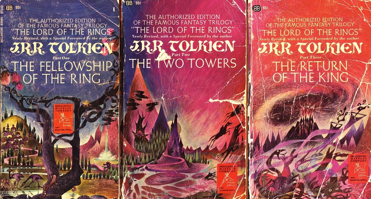
Indeed, the vignette for The Hobbit was but a prelude to the unveiling to the world of the epic triptych which would be the 1965 Ballentine edition of Tolkiens Lord of the Rings trilogy of books. If the lion and emus and bulbous fruit of The Hobbit had managed to summon such disgruntled bile from the Professor who knows what words of scorn and derision the flying horses and piles of snakes may have spurted forth from the raging nib of his enraged and bitter quill. 

Barbera Remington | Lord of the Rings | 1965
The attention to detail in Harvard Lampoons parody of Remingtons Lord of the Rings cover is second to none.  Not only is the illustration style, colour and tone a dead match, the typography perfectly errs on the correct side of a hugely expensive and drawn out copyright dispute and outright plagiarism.  The book titles are rendered rather plainly and quite handsomely in Goudy Sans, offering an austere yet organic, anti-industrialism echoing the hand-lettered rather than mechanical and authors name in rather florid psychedelic-age redrawing of William Morrises Troy lettering, itself something of a victorian revival of medieval insular calligraphy. Tolkien being a massive fan of Morris should have approved somewhat, but instead, alas, cried 'foul'.

It is clear that whole cover of Bored of the Rings has been near fraudulently designed to entice a mushroom-stuffed hippy student of the early1970s to fumblingly pick it up from the rickety wire carousel of paperbacks on the newspaper stand while buying a pouch of Longbottom Leaf and some cigarette papers  and hand over the loot to the newspaper vendor (played, for some reason, by Richard Prior) without noticing they'd been hoodwinked before it was too late.

As well as setting up the books persistent self-referential gags about being a crass attempt to cash in on the commercial success of Lord of the Rings,  the aping of the Ballentine first authorised edition of The Lord of the Rings cover design serves to tie Bored of the Rings to that very specific time and place, one single Thursday afternoon in the America as the sun slowly set on the 1960s. Nixon was in the Whitehouse, Students were taking over Harvard University, moon landings were on the horizon (of the moon, presumably, but maybe the Nevada desert, who really knows, maaan?), the Manson Family were planning to unleash Helter Skelter upon the West Coast and Bryan Adams was standing on yo mommas porch. Yes, it was the Summer of 69. Ahem ahem.

Bored of the Rings is very much an artifact of those ancient days and is as much about the late sixties or early seventies America as it is about The Lord of The Rings. Besides being a parody of Tolkien work, the novel is riddled with puns and references that mean absolutely nothing to a contemporary reader, many of which have sank so far deep into the collective unconscious as to be completely unrecoverable except by all but the most determined delver of cultural detritus. One such unponderable reference,  Garfinckel, an elf, named for a department store chain that went bankrupt in the 1990s. The contemporary publishers conceit of updating the books cover to reflect the visual language of more recent movie adaptations, while keeping the tongue-in-cheek mercantile humour, lose much of the specificity of the text. Other non-movie tie-in covers attempt to position the book as generic comedic fantasy, glossing over the precise context. What the book really needs in 2018 is not an updated cover, but a critical edition with endless footnotes and meandering commentary that firmly establishes the historical context while explaining the referential jokes for the undereducated and elucidating upon the long lasting legacy of the esteemed work.

The Harvard Lampoon was itself an grotesque overblown student magazine reinvented by Doug Kenny and Henry Beard that served as an exclusive, gentrified breeding pit for their peculiar class of  self-indulgent comedian whose natural habitat - the publishing niche that occupies the cocaine filled valley that lays between the great stone Argonath of Hugh Hefner and Alfred E. Neumann - was about to spill out of the gates of Harvard and take their Lampooning on to a National stage, as the National Lampoon, then promptly set off on the epic quest across strange yet bewildering landscapes of myth that is Vacation with Chevvy Chase. But while all that was in the far future of 1983, which is now the dim and distant past on 1983, the spectre of fantasy genre parody never quite left the Lampoon frat-house.

Conan the Barbarian - Frazetta

The National Lampoons Vacation - Boris Vallejo

It is at about this point when writing an article, when it is traditional for the Scribes of Zhu go off on a third pointless tangent, weaving the text into a kind of pseudo-intellectual equivalent of a bunch of dozey Boggies poking aimlessly at some suspicious looking fungi in their back garden when they said they were going to take the recycling bin out to the Dark Lands beyond Bakdôr. This is usually because the aforementioned scribes have got completely bored with the original subject, but also to pad out the post with as much verbiage as possible in the vain hope that the reader is distracted by the advertisements on the right hand side of the website and decide to buy an Oldhammer T-shirt or maybe some Dungeon Floorplans. And this article will prove, regrettably, no different.

Hobbit Poster via Two Warps to Neptune


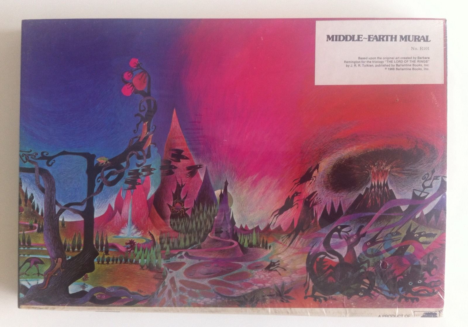
Unfortunately Barbera Remington's paintings for the covers of The Hobbit and The Lord of the Rings gives us the perfect, but also ideal, material for just such a meandering diversion. Having already discussed at inordinate and mind-numbing length the vicereal physical response by the esteemed yet grouchy author of the original book to the artwork, and its profound yet significant influence on the cover of Bored of the Rings  it is perhaps not too far fetched to examine the legacy of this maligned work of genius beyond the confines and out into the wide world beyond the paperbacked borders, and into the nefarious realm of knock-off-publishing and authorised fully-licenced merchandising tie-ins that is the sordid yet mysterious world of Fantasy Gaming.


Lord of the Rings | Jigsaw Puzzle via Two Warps to Neptune

The blotter paper soaked with dramatic blue and magenta splodges of paint expressing a volatile quazi-Hendrixian purple haze, perfectly suited for expressing the contents of what is, effectively, a book about going on a very. long. trip. Remmingtons stylistic flourishes and bold painterly approach continued to have a lingering influence on fantasy art that long outlasted the grumpy outpouring of bitter disdain and reproach from Tolkien. A fact that would have no doubt annoyed him considerably.

War of the Ring | Tim Kirk | FGU | 1977

Tim Kirk's dramatic cover for FGU's WAR OF THE RING is obviously inspired by Remmingtons masterpiece, and skillfully employs the motif of savage Orcs bringing their putrid red stench with them wherever they travel, great steaming clouds of noxious gasses staining the sky and land, laying down some really heavy vibes. The bright clean spring air of the proud upright banners, wholesome trees and noble warriors railed against them. Meanwhile the contrasting FGU logo and the masthead create a yin-yang effect of cosmic balance.

Divine Right | Kenneth Rahman | TSR | 1979

The cover of TSRs tactical wargame Divine Right by "Elladan Elrohir" aka Kenneth Rahman. Mount doom spewing clotted red clouds into the sky populated by a ghostly wild hunt. 

 Lord of the Rings | Ralph Bakshi | 1978

Remmingtons rendering of the power of evil to materially distort the doors of perception and stain the world with evil was something Ralph Bakshi had played with while working on Spider-man, where the  development of the psychotropic mise-en-scene as mirror of a tortured mind was no doubt partly responsible for the lurid evil kaleidoscopic effects seen in Bakshis great cinematic adaptation of The Lord of the Rings.

Mark Rothko | Untitled 'Orcs in Mordor'  | 1961 | via


It's unquestionable that Remmingtons work has had a significant and lasting impact in the genre, but eventually "Tolkien Art" gave way to various forms of naturalism, from the clean bright renderings of the Hildebrandts to the soft, misty drawings of Alan Lee.

Returning to the subject at hand, it is worth noting the Lampoons cover art of Bored of the Rings is an early work by none other than the great Micheal Frith, and it clearly displays the tongue-in-cheek mix of whimsy, subtlety, fantasy and humour that would serve him well as the Creative Director of The Jim Henson Company and as the Concept Artist responsible for the creation of  Muppets such as Scred from Saturday Night Lives Land of Gorch and the frankly maddening and carefree and song-obsessed denizens of Fraggle Rock, who bare more than a little resemblance and maybe owe something of their starey-eyed madcap ways to Bored of the Rings hobbit analogues, the Boggies. In fact it's difficult not to see them as some form of distant yet annoying cousin who only ever phones to borrow money. "In a hole in the ground, there lived a Fraggle."

Look Ma, I caught a Boggie
Micheal Frith with Spam, Frito and Lavalier from the big screen adaptation


Concerning Boggies | Micheal Frith | via


Leaving the unspeakably middle double-constonanted family tree of Hobbit, Boggie, Fraggle (and Hoggle from Labyrinth) aside, not to say, chopping the whole thing down for the sake of all our sanities, we return to the cover of The Bored of the Rings. Here we can see Frith was less following in Remmingtons  esteemed footsteps than creeping up behind her with a cudgle, ready to mug every last ounce of artistic license available. Having waded through the groan inducing pun-drenched excuse for a novel, myself it's clear that Frith either, like Remmington before him, just didn't have time, or just couldn't be bothered with it or thought he had a better idea of what should have been going on. And who could blame him? It's hard to know where to begin, except to say that having a cover so profoundly divorced from the narrative contained within could only be part of a studiously wrought meta-parody - perfectly reflecting the Ballantine editions lack of fidelity to the text. Pure coincidence, or rather pure lack of coincidence, could not have missed the mark so astutely.


Toothbrush that was forged anew.

Starting with the central visual feature of the composition, a dazzling white toothbrush emerging from a river. There is no lady of the lake dismembered arm raising an excalibur-like toothbrush from the waters scene at all. Whatsoever. At all. Unless I missed it, which is entirely possible as I'm not infallible. There are references to tooth-paste, tooth-fairies, and well, just teeth. But no Tooth brush.  If you don't believe me you can go read it yourself, it's like an epic quest, but more pointless "Hunt for the Toothbrush". 


C69: Pig-faced Nozdrul on Wild Boar

The Nozdrul - evil servants of Sorhed only dress up in lady pig costumes while they are in disguise in the sordid and provincial village of Whee, but not riding around the country-side on the back of giant pigs, which they do all the time. I suppose this shows Frith had made some acquaintance with the text, but really either didn't care about the basics or couldn't pass up the opportunity to paint a pig riding pig.

The buxom sow-riding pig-woman Nozdrul is a blindingly genius concept of geniusness.  It's hard to overstate the sheer cultural impact and magnitude of this perilous porcine picture. The fearsome yet saucy Nozdrul as buxom pig-lady predates the creation of the fearsome yet glamorous buxom pig-lady Miss Piggy (designed by Bonnie Erickson at the Jim Henson company) by a whole seven years. The Hildebrandt Brothers infamous but debatable Lizard Goblin Pig Orcs by the same seven years and the emergence of the archaic yey porcine  Pig-Faced Orcs of Dungeons and Dragons by eight. All in all this may be the first image of an anthropomorphic pig riding a pig in all of humanoid history. Then again, it probably isn't. But it's certainly an image that joins the dots between Tolkienesque Fantasy and pig-headed humanoid-monsters.


C69: Flying Beasties

I don't recall any giant flying black grinning hippopotamuses, or the Nozdrul  taking winged flight at all, so this seems to be a reference to the original book, or Remmingtons weird crows and sky-leaping horses from her Lord of the Rings cover although the Pegasus-knight does seem to be referencing the Pirated 1965 Ace Paperback cover of The Two Towers. Remmingtons bulbous pink Christmas tree fruit also make an appearance, like a sinister art nouveaux streetlamp triffiding its way onto the page and demarcating the territory for the twisted gods of parody, even if they do not appear in the book.

Frito | Goodgulf | Nudie-elf | Arrowroot
Mounted. on Sheep.

There is something in the round-eyed stare of Frito the hobbit reminds one of the manic stare of Gobo Fraggle, an unfortunate family resemblance that suggests dubious parentage we've already dwelled on for too long, and is probably best to gloss over at this juncture. Needless to say, this is not how Frito crosses any river anywhere in the book.

The general air of wanton smuttyness returns with the rather pink elf-lady riding a sheep. No saucy elf lady rides a sheep in Bored of the Rings. There is a saucy elf lady who tries to seduce Frito into giving her his ring, but that episode itself is presented as a quote from the main story, and doesn't appear in the main story. And there aren't any sheep involved in that bit, fortunately.

Next we have the Wizard Goodgulf. Shades and a dark green speedway-rider motorcycle helmet. Perhaps coincidentally ZZ-Top formed in 1969 the fated year that Bored of the Rings was published, releasing their first sub-Led-Zepplin single - Salt Lick, but wouldn't don the sunglasses and extreme beard image they would become famous for until the late 1970s. Goodgulfs transformation from discredited rosicrucian to southern blues-rock fashion icon may have been his greatest feat of magic, but maybe not. 

Arrowroot Son of Arrowshirt a somewhat ghostly pale-faced impersonation of The Lone Ranger. in his cowboy hat and fringed jacket, a gag that draws Aragorn, and Lower Middle Earth with it into a kind of cheap frontier Americana.

Finally, we see one of Tolkiens hated emus, dead at the bottom. Possibly strangled by a hookah pipe, in the library by Colonel Custard.  The Letters of J.R.R. Tolkien  were not published until 1981, some 11 years after Bored of the Rings, so it is doubtful that Frith got wind of Tolkiens dislike of the beast and symbolically slaughtered the bird on Tolkiens behalf. As far as I know Tolkien never read Bored of the Rings, nor passed any comment upon the novel or it's cover, but I can't help thinking he'd have been mildly gratified by the murder of this irksome antipodean intruder, if quite outraged yet incensed by the rest of it.


Monday, 25 September 2017

On Ridgewell

I first encountered the work of John Ridgewell in the 1977 Paper Tiger volume Flights of Icarus, a fantasy art compiled by Roger Dean, where his work appears alongside fantasy art luminaries such as Melvyn Grant, John Blanche and Alan Lee.

Gate 1976. John Ridgewell

Although given such high standing company in the illustrative and fantasy art world, one can't help but feel that Ridgewells paintings don't quite belong among the parade of classic prog-rock album, pulp science-fiction covers, poster art, spaceships, dinosaurs and psychedelic horror that the compilation is largely comprised of.  Ridgewell is a serious painter, following the surrealism and cubism Georges Braques and René Magritte, but with stylistic nods to Constable or Turner firmly within an English tradition, but also consisting of reflections on painting, genre and art itself .

Parallels could be drawn with Roger Deans or Rodney Matthews landscape work, fantastical spaces that invite the viewer in to meditate upon what forms existence in such a space might take and what states of mind they may provoke, but whereas Dean and Matthews offer the clean, stylised, alien and exotic, Ridgewells landscapes are more familiar, earthy and rustic. 

John Ridgewell


Post-apocalyptic, bombed out and left to seed, destroyed and overgrown, beginning to be reclaimed by nature, landscapes in earthtones, soft grey and somber greens.  A small, out of scale picnic robs the ruins of their complete dereliction, but the picnickers are unseen, human scale milkbottles left out on the front-step. One could easily imagine a pair of Froudian imps or gnomes, a hobbit or spriggan encroaching onto the scene and transforming it into a thing of fairytale whimsy, or even a Raymond Briggs character blithely going about their daily business. But the earth stained and rain clad folk that inhabit these lands remain stubbornly out of sight, their absence rejecting a straight picture-book reading.

The crumbling revenants of architecture are not often an ancient Kubla Khan or Ozymanidian temple, no classical ruin of Minerva nor Welsh Gothic of Tintern Abbey beloved by Turner  but more often structures of Victorian iron and brickwork,  The antique romance of the ruin is then interrupted by a subtle and uncanny modernity - the ghostly clean lines and tidy right angles - interpreted as a white gloss painted door frame that could not possibly have witstood the destruction of the rest of the building, their brittle geometry projecting a wrongness against the mud and mossy brick. In other examples these rectangular forms suggest perhaps a window or picture frame which intrudes into the illusionary space, distorting the sense of scale, shrinking what at first glance may be some far off dilapidated construction to a tiny miniature model on a shelf, or a postcard glued to a wall and overgrown with moss.

These ghostly white structures echo the proportions of the picture frame or visually running parallel, the frames within frames draw attention to the works existence as a work of artifice. This reflexivity is at once an uncomfortable rejection of painting as what could be mistaken for a simple illusionistic, picture-book fantasy as well as a collapse of pictorial space. Instead of the simple reverie of the photograph, the image a substitute for a view of the subject the viewer is invited to contemplate the illusionistic, metaphysical and symbolic nature of the painting, drawing an insistence of considering the image as object in the here and now, the painting interacts within it's famed and hung environment, it's rhetoric spilling out, bringing the frame itself into question, perhaps all we see beyond here is too only a glibly authentic illusion, painstakinlgy constructed by some greater, absent hand. And this seemingly solid illusion, which like the ruined architectural features within the picture, will pass in time.


Easter painting | John Ridgewell

Often the locations feel like they could be locations glimpsed out of the corner of the eye in Russell Hobans Riddley Walker (1980). The novels East England is thrown back to a new iron age by a now mythologised and half misunderstood nuclear war. As a post-apocalypse, anachronistic modernisms are interwoven amidst the ruins of more ancient spaces, fractures of  culture and language, as Ridgewells visual language, the surreal blending of traditional oil painting genres, the landscape and the still life, while adhering to the formal qualities of genre, are disquietly interrupted by echoes of sraight-line minimalism and modernity.
There we wer then in amongst the broakin stoans the grean rot and the number creaper with the rain all drenching down and peltering on them dead stoans stumps and stannings. Spattering on crumbelt conkreat and bustit birk and durdling in the puddls gurgling down the runnels of the dead town. A kynd of greanish lite to that day from the rain the grean rot and the number creaper and the dead town pong wer going up all grean smelling in that greanish lite. Dog pong as wel a black smel in the grey rain.
Russell Hoban - Riddley Walker  

Riddleys language creeps in through the minds ear and performs it's own peculiar magic. Eschewing the naturalism of the novels dull muted language, instead Riddley-speak consists of fractured and ruined archaisms - kynd  rubbing shoulders with 20th century slang dog pong. The brutal and disjointed myths constructed out of misunderstandings of and pieced-together historical record. Riddleys language, stories and journey providing holes in time back to the 20th century looking forward into the post-apocalyptic future as well as back into a distant historical past freed from it's linear narrative and erupting like Cornelia Parker's shed, all shrapnel and falling masonry in the ever present now.

John Ridgewell The Old Wall 1965 via
Jimmy Page | Led Zeppelin IV : 1971
The mythic of a rustic imaginary and a post-war dereliction looms large in the baby-boomer imaginary. Led Zeppelin IV, the cover, consciously or not echoes Ridgewells composition and image making strategy, although rendered in photo-montage rather than oil-paint. The bombed out between internal and external architectural spaces, the landscape and the imagination and the patina of decay. Led Zeppelin IV contains the most overt fantasy references in their ouvre, Misty Mountain Hop and the Battle of Evermore, direct from Tolkiens the Lord of the Rings.

Tolkien ever one to bemoan reading his Lord of the Rings as being specifically about World War Two or anything else, for that matter, aware nonetheless of the shadow of the conflict, memories of it's fighting and aftermath stretched over the popular reception of his work.
Many of the houses that they had known were missing. Some seemed to have been burned down. The pleasant row of old hobbit-holes in the bank on the north side of the Pool were deserted, and their little gardens that used to run down bright to the water’s edge were rank with weeds. Worse, there was a whole line of the ugly new houses all along Pool Side, where the Hobbiton Road ran close to the bank. An avenue of trees had stood there. They were all gone.
Lord of the Rings - Tolkien 
If we frame the Scouring of the Shire as a fantastical reimagining of soldiers returning to post-war England,  as we can assume many readers in the '50s and '60s readily did, then Ridgwells inclusion in a coffee-table collection of genre led fantasy art such as Flights of Icarus seems more reasonable, if not inevitable, due to shared sensibilities.

Door | John Ridgewell


We find another example of the ruin as gateway to the fantastic in post-war imaginary, Alan Gardners Eliador (1965). Here children playing in the derelict streets of Manchester are transported to a solemn mist-shrouded, mythical Narnia, whose sacred artefacts of the Tuatha Dé Danann when lifted out of the dreamscape and placed in the real world become transposed into the most mundane objects imaginable, yet manage to interfere with television transmissions concreting the power of the mythic in the contemporary and domestic.
Roland picked his way over the rubble to the other side of the church door, and there he found a door,  which sagged open on broken hinges: two floorboards were nailed across the doorway. Roland climbed into a passage with several rooms leading off it. Water tricked from a fractured pipe. There were the smells of soot and cat.   
The rooms were empty except for the things that are always left behind.  There were some mouldering Sunday-school registers, a brassbound Bible, a faded sepia photograph of the Whitsun procession of 1909, a copy of Kirktons Standard Temperance Reciter, presented to John Beddowes  by the Pendlebury Band of Hope, February 1888. There was a broken saucer. There was a jam-jar furred green with long-dried water. 
Eliador - Alan Garner 
Setting aside the parallels between Garners ruined church and Hobans cathedral (the grean, the animal smel)  Garners catalogue of ephemera could well have composed one of Ridgewells 'portraits', or a page from Salvador Dali's diary, had Salv' been blessed by being born in Salford.

Tabletop Portrait of Doug Harris

Portraits, oil painted collections of ephemera, fragments of imagery, tokens of places and locations pulled into the horizon - perhaps a psychogeographical map of the internal life, places lived or loved or a portfolio of property, a painted display of ownership and wealth, as the purpose served by the landscape in oils tradition served, rendered conveniently observable and neatly arranged on a shelf.

Ridgewells tabletop paintings more than any other of his works are a meditation on the blending of oil painting painting genres, the still life and the landscape.  presenting a miniature world often contained within a space that appears interior and domestic, the walls becoming ethereal showing the distant landscape beyond, or suggesting a misty mural, b.  else seeded spontaneously within the wreckage, creating a contained, fairy tableaux. The play of scale and artefact, a goldfish bowl becomes a monstrously proportioned intrusion, a lace tablecloth a vast and treacherous cliff.

Tabletop (in Flights of Icarus ) John Ridgewell

Tabletop | John Ridgewell

Johns string paintings we find the space sealed within itself, a painting of a painting that has been finished and ready to be shipped off, or hidden in storage. The thin ghost-white rectangular forms, interrupting the landscape reappears from other works, but instead of an architectural feature, it binds the painting together as string. Pushing trompe-l'œil to its logical conclusion, the string is not simply painted, as the paper edges are, but physically modelled out of oil paint, built up layer by layer.  Is the paper itself decorated, the artist unable to stop himself comulsively turning every surface into a landscape? or is the wrapping becoming transparent betraying the contents underneath, or perhaps the grasses are growing through? The ambiguities that walk through Ridgewells work, seem to have arrived at a destination, painting as subject, themes of rural and rustic, nature reclaiming the man-made, illusionistic and abstract, the inevitability of transience, the dissolution of boundaries, spatial and temporal transportation, something hidden, or missing. A sense of quiet.

Tuesday, 26 January 2016

Of Ancient Orcish Animosity

Two Orcs | Tim Kirk | 1975
Presently two orcs came into view. One was clad in ragged brown and was armed with a bow of horn; it was of a small breed, black-skinned, with wide and snuffling nostrils: evidently a tracker of some kind. The other was a big fighting-orc, like those of Shagrat’s company, bearing the token of the Eye. He also had a bow at his back and carried a short broad-headed spear. As usual they were quarrelling, and being of different breeds they used the Common Speech after their fashion.

J.R.R. Tolkien - The Lord of the Rings, The Return of the King. 1955

Jon Peterson has unearthed what may be the first published fantasy wargame rules, by Leonard Patt in his "Rules for Middle Earth" (RfME) as published in The Courier the newsletter of the New England Wargamers Association devised way back in 1970.

Leonard Patt Rules for Middle Earth 1970
One thing stood out to me in reading Jons assessment of RfME which focuses mainly on it's textual and conceptual influence on Gary Gygax and Jeff Perrens Chainmail - that this is also, very likely, the first instance of a rule for determining the effects of inter-goblinoid animosity, the bane of every Orc generals life, and a mainstay of fantasy tabletop gaming for 40 odd years.

Patt writes “Orcs were basically very obnoxious and disagreeable even to each other” and when they “approach within four inches of one another, 1 die is thrown to see how they react.” On a roll of 1, the orcs will fall on each other in a bloody mass of loathing and combat.

Chainmail 3rd Edtion

In Chainmail (1971-1975), which up until the discovery of RfME was long considered to be the first published fantasy wargames rules, Gygax and Perren have it that "if Orcs of different kinds approach within a charge move of each other, and they are not meleed by the enemy, they will attack each other unless a score of 4 or better is rolled on an  obedience die." Chainmail of course, is the daddy of Dungeons & Dragons - the game that would dominate fantasy gaming throughout the late 70s and early 80s, and in the AD&D Monster Manual (1977) had quarrelsome Orcs with a chance of fighting among themselves 75% of the time.


Middle Earth Wargames Rules  by SELWG  (1976) declares "all Orcs / Man-Orcs / Uruks will quarrel among themselves." Then gives a 1/6 chance of a quarrel breaking out. On the subsequent turn casualties are rolled for, with a 1/3 saving throw. Presence of a Nazgûl or an enemy unit mitigates the unruly behavior, and the Orcs just do as they're told. It's nice that Tolkiens language is echoed here in the use of the word quarrel, and it's also interesting that MEWR uses RfME's less likely 1/6 than Chainmails 1/2 chance.

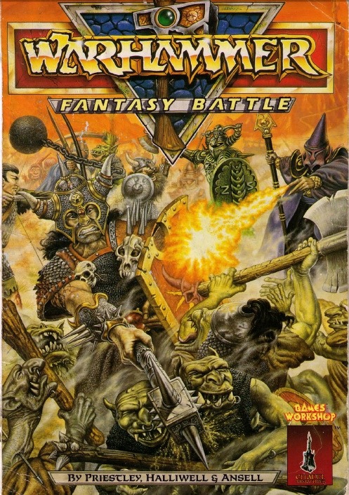
Of the ancient fantasy wargaming tomes I have laying around, Tony Bath's Setting up a Wargames Campaign (1973) Mike & Sheila Gilberts Archworld (1977), don't have rules for goblin quarreling - these being somewhat less Tolkienesque settings, and neither do they appear in Richard Halliwell and Rick Priestly's Reaper (1981) nor John Treadaways esteemed Lidless Eye army lists (1984) for WRG 6th Ed, which make no mention of inter-goblinoid fighting, nor does WRG 4th Edition's "Suggested adaptions for Sword & Sorcery fanatics" (1973).

Warhammer 1st Edition | John Blanche | 1983
 
1st edition Warhammer (1983) also has no rules for misbehaving goblins. However, in he supplement Forces of Fantasy (1984)  this oversight is fixed with the introduction of the infamous inter-goblinoid animosity table. And whilst this applies to Goblins, not Orcs (although we must acknowledge the fluidity of the terms, creatures previously known as Red Orc are now termed Red Goblins, etc.) the basis and mainstay of Orcish psychology in the Warhammer game for the rest of  its shelf-life from 2nd-8th edition is lain down here. In FoF a basic 1/6 chance is given of Animosity taking over, then a second die-roll to determine the Orcs behaviors, from no discernible effect to charging friendly troops. The behavior roll has several situational modifiers, from the ability of any unit leaders that may be present, to the presence of the enemy.  The rules also suggest tracking animosity points, so that after a number of infractions, the regiments will hate each other and attack on sight - the rules as narrative generator, feeding grudges into battle.

As such Warhammer seems to follow the structure of MEWR - roll for the chance of animosity happening, then roll for the effect. Rather than RfME or Chainmails single roll then subsequent inevitable infighting. Somewhat predictably, 2nd Edition Warhammer then turns this on it's head, having a single die roll 1/6 followed by a leadership test to rally the troops. 3rd edition has a single roll modified by the ld score, and later editions return to the mayhem of 1st edition.

War of the Ring  | Tim Kirk | FGU 1977

 To Pippin's surprise he found that much of the talk was intelligible many of the Orcs were using ordinary language. Apparently the members of two or three quite different tribes were present, and they could not understand one another's orc-speech. There was an angry debate concerning what they were to do now: which way they were to take and what should be done with the prisoners.
J.R.R. Tolkien - The Lord of the Rings, The Two Towers 1955
Tolkiens Orcs, be they skirting the southern the edges of Fangorn forest, taking the Hobbits to Isengard, or running amok in the tower of Cirith Ungol are not simply fighting amongst themselves because they hate each other (which they do, no doubt) but arguing about who gets the spoils of war - the prize of Hobbit captives, alive or dead, or the Bagginses Mithril shirt, or conflicting orders in Mordor. This  suggests a more Tolkienesque model of Orcish behavior would have them be narratively motivated - the attainment of some prize or objective by one unit of Orcs, triggering the attempt to steal or usurp that prize by others nearby, so they may hope to earn glory from their masters. Similarly the clash of Orcs at the Isenmouthe that allowed Frodo and Sam to slip away causes minor scuffles and confusion, caused by different groups of Orcs trying to follow orders to occupy the same space, rather than bloodshed.

Still, just rolling dice to have your own troops bash each others heads in is a venerable conceit, emerging from the dawn of the fantasy wargaming hobby, and certainly adds to the colour.

Thursday, 31 December 2015

An Unnatural History of the Fighting Fantasy Orc

The first ever encounter in the first ever Fighting Fantasy adventure, is an encounter with an ORC...  he's slumped asleep in a chair with a rather funky hat and patchwork leather armour on, and one has the choice to sneak past him or not.


ORC GUARD (note the wrong-handedness, maybe he is an an early MUTANT ORC, but no Russ admits it was just a slip) proving that exotic headgear is the nme of the game if you mean business, if you want to get a head, get a hat!

Or just be one of those ORCS sitting around  a table. One of the wonderful things about Russ Nicholsons ORCS is how threadbare, downtrodden, grumpy and human they are. Their bulbous noses and pointy ears give them a fairytale and aged appearance that perfectly suits Russ complex ornate and grungy visual style.  Russ's drawing there reminds me of these two disheveled denizens of Oil Drum Lane.

You dirty old Orc!


Perhaps not an intentional reference, but Russ's ORCS, like Galton & Simpsons rag and bone men, are cruel, occasionally nasty but are anything but two dimensional monsters, they seem to have a tired, grubby existence outside of being the bad-guys. They're almost sympathetic characters, something that no other illustrator of FF would quite brings to the mix. 

And here's a mixed bag of creatures, an ORC two GOBLINs and a green DWARF. Russ's Orc here is a slightly more youthful, muscular type than we encountered in Warlock of Firetop Mountain - but still, to my mind somewhat reminiscent of Harry H. Corbett.


The next ORCS we meet are haunting FF3  The Forest of Doom (1983), Malcom Barters use of white space through Forest of doom is masterful, integrating elements into the page in an almost dreamlike manner, capturing the sunburst through the trees. His ORCs seem of a kind with the precedent set by Russ, gangly large headed goblin-men, dressed in rags with unsavory appetites.

Ian McCaig Deathtrap Dungeon FF7. Here the ORC becomes much more muscular than  Nicholsons and Barters skinny, gangly freaks. The viceral form of Ians drawing is really quite outstanding, there's no wonder he is one of the most sought after concept artists and illustrators. A violent, action Gladatorial figure,  wearing a wide "championship belt", ranking him up against boxers and wrestlers alike. It is the first, but by no means the last time we see the ORC topknot. In fact this haircut comes to be something of a signature device of the Fighting Fantasy ORC. It could be a Hindu Shika, a Manchu queue or perhaps displaying various Arabian influences. It does also remind me of the Elf warriors in Ralph Bakshis seminal 1977 fantasy animation Wizards,  designed by the mighty pen of Mike Ploog although the creatures concerned are not identified as ORCs.


It may be significant that both Balthus Dire and the GARK as drawn by Russ Nicholson in FF3 The Citadel of Chaos also sport the same hair style, suggesting it's something of a cultural rather than racial motif in Allansia....

And it turns up again in FF8s bulgey eyed and bobble-headed SWAMP ORCS of Scorpion Swamp by Duncan Smith - strangely missed this branch of the Orc lineage first time around (thanks to Furgolas for the spot), probably because they look a little too much like goblins or even kobolds than what we have become accustomed to as Orcs. They seem to keep the ragged dishevelled look of Russ's original, but have something of Dave Trampiers Wormy.

Thanks to Kelvin Green for noting that I'd originally missed this one...


Les Edwards original cover for 1984s FF#8 Caverns of the Snow Witch (incidentally, available as an art print from Les site) very much in line with what Ian McCaig had set out in Deathtrap Dungeon, with topknot, small pointy nose and athletic physique.This ORC however, is kitted out with piecemeal leather and studded armour, and some natty tiger-skin pants.  Similar to original Warlock of Firetop Mountain that has a different depiction of Zagor on the cover than the internal art, the internal depiction of the ORC doesn't quite follow the same vision...


The internal art by Gary Ward & Edward Crosby features Fighting Fantasy's first bald ORC. It should come as no surprise that Ward & Crosby are one (two) of my favourite Fighting Fantasy illustrators. Their line and pattern is like Russ Nicholson meets David Trampier, their drawings have a heavy, ornate, tangible quality that wouldn't be out of place in the AD&D Fiend Folio. They also did the drawings of Dave Morris Castle of Lost Souls solo adventure in White Dwarf, but as far as I know nothing else in the fantasy genre.

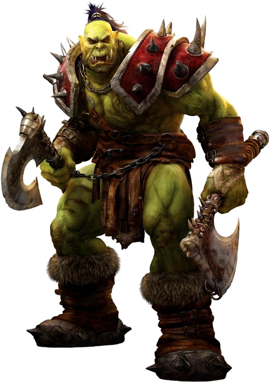
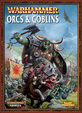
Ward & Crosby give their ORC a decidedly simian look, possibly following the work of Frank Frazetta in his Lord of the Rings portfolio 1975 but with further exaggerations - the low cranium, deep eye-sockets, sunken cheeks, no nose, extended maxilla (upper jaw) and tusks. As far as I know this is the first ever depiction of an ORC with this specific set of facial features, but it won't be the last. This look would go on to dominate the portrayal of ORCS in popular culture throughout the 80's and 90s, Citadel Miniatures mid 80s Orcs (sculpted by Kevin Adams) the Space Orks in the Waargh The Ork supplements for Warhammer 40k, and subsequently picked up by Blizzard in their Warcraft games.

FF14 - Temple of Terror (1985) - ORC ASSASSIN by Bill Houston. Much more humanoid proportions. It might just be that he is an ORC ASSASSIN, but he reminds me somewhat of Zarak the Evil Half-Orc Assassin from the 1983 AD&D plastic toy range, Half-Orcs are MAN-ORCs in Fighting Fantasy parlance.

Zarak via

HALF-ORCs? one may well ask half ORC and half-WHAT? whilst usually it means "half-human" in Fighting Fantasy it could be anything, and in this case TROLL!


"Orc Charge" by Chris Achilleos - however it's publication in Out of the Pit (1985) identifies the subject matter as DORAGAR - the long haired, spiky armoured crossbreeds betwixt TROLL and ORC, so not a depiction of ORCS proper, and deserve an enquiry all of their own, whence they come from and how deviating their depictions are.  It proved popular with Games Workshop who later used it twice.
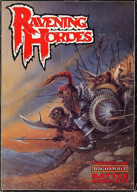
Ravening Hordes

The front cover of the Ravening Hordes (1987) supplement for Warhammer Fantasy Battle 2nd Edition (by far the  greatest edition of Warhammer ever). Interestingly DORAGAR don't appear in Warhammerland at all, and we assume they are intended to be Orcs, despite their dissimilarity with the designs of Warhamer Orcs, not least because they're not bright green.

White Dwarf 85. Still not ORCS tho.

As well as the front cover of Games Workshops Roleplaying Monthly: White Dwarf #78.  Art prints are available from from Chris web site I've yet to determine whether this piece was commissioned for Out of the Pit specifically as a depiction of the DORAGAR, and later renamed as "Orc Charge" to make the it more attractive for subsequent licensing, or whether Chris originally planned it as a depiction of ORCs  and Marc Gascoigne or someone else involved at Puffin picked it out to illustrate the DORAGAR. Either way, according to Out of the Pit, these are emphatically not the ORCS we were looking for...

And speaking of Games Workshop, the very next incarnation of the actual Fighting Fantasy ORC is 1986 Citadel Miniatures range of 60mm Fighting Fantasy toy soldiers. Pretty much eschewing both the features of the Fighting Fantasy ORC and the contemporary ranges of Citadel Miniatures Orcs which also tended to be quite wiry. Instead we have large, hulkng, muscular beasts, slightly reminiscent of the exaggerated musculature of the He-Man action figures popular at the time, which, when painted green, give the impression of the Incredible Hulk with a monkey head, which can only be a good thing!

via the wonderful Fantasy Toy Soliders Blog

The 60mm Citadel ORCs can also be seen as drawn by Dave Andrews in an advert for the range in the 1986 Citadel Journal, alongside SKELETONS, GOBLINS and OGRES. Dave brings his characteristic bold graphic look to the models. The whole range can be seen on the Fantasy Toy Soliders Blog and well worth a look. Facially, if not physically these ORCs do carry forward many of the features of the Ward & Crosby Orc, and while the Simian-Hulk look does recur in ORCs in other places (Warcraft, Warhammer) it's a long while before it returns to Fighting Fantasy.


Bone-throwing ORC SHAMAN and  HASHAK - the ORC-GOD both drawn by Paul Bonner and both appearing in Marc Gasgoines opus  Titan the Fighting Fantasy World (1987). The large-headed, tusked-simian, sunken cheekbones  strongly resembles Ward & Crosby's frozen Orc in Caverns of the Snow Witch, but also retain some of the gangly, rope-muscled physique of earlier ORCs. Paul would go on to produce concept art and illustration for Citadel Miniatures in a similar vein. However we don't see this particular combination of physiology return to the Fighting Fantasy milieu.

By strange coincidence Titan signals a bit of a quite period for the humble ORC.  Fighting Fantasy as a series foregoes the traditional Dungeon / Wilderness fantasy gaming setting and wanders off into more exotic locales, outer-space, under water, the mystic east and beyond for several books...


But then, the ORCs return, as do we...  to Baron Sukumvits Deathtrap Dungeon in the long awaited sequel, FF21 Trial of the Champions. Here  Brian Williams gives us two muscular, furry panted fellows - shades of Barry Windsor-Smiths design for  Marvel comics Conan the Barbarian but Brian also takes the ORC back to Ian McCaigs rendition in Deathtrap Dungeon, with matching topknots, creating consistency with the pre-simian image of the Orc.

Russ Nicholson follows suit with a rather crazed PYGMY ORC in FF23 Masks of Mayhem. It's one of the features of Fighting Fantasy that rather than have creatures exist in ecological niches - i.e. GOBLINS as small ORCS, there is ever increasing variety and specialisation, so instead of just ORCS, Fighting Fantasy actually has 12 ORC variants, from MARSH ORCS to SNIFFER ORCS and of course Masks of Mayhems PYGMY ORC. And that's not including the half-breeds such as the MAN-ORC or ORC-DARKELF crossbreed known as the BLACKHEARTS

One of these more exotic types turns up next...
The vampiric BLOOD ORCS. These look like they might be half-breeds with  AD&D Barbed Devils along side a more traditional vision of the ORCS...
Alan Langfords, FF24 Creature of Havoc, whose ORC commander strikes an impressive pose. Upright, very human stance and proportions, somewhat reminiscent of the Treens from Dan Dare. It's the only instance of an ORC in Fighting Fantasy that has this very upright humanoid stance and proportions. We also get to see one of Langfords classic horned, heavily armoured Lizardmen at the back, which Alan introduced way back in FF7 Island of the Lizard King (1984).

Dave Carsons hideous ORC in FF25 Beneath Nightmare Castle. Weird pointy head-gear and strange large watery eyes seem to make this ORC hypnotically disgusting.

FF26 Crypt of the Sorcerer (1987) by John Sibbick. These ORCS are very much in the same mold as mid-1980s Citadel Miniatures (Sibbick had provided artwork based on Citadel Miniatures designs for Warhammer Fantasy Battle 3rd Edition and Warhammer Fantasy Roleplay 1st Edition), and indeed many of these motifs, especially the squarish jutting lower jaw can be seen to go back to Citadel Miniatures Fantasy Tribe range of Orcs  and their Ral Partha forebears.

This style of ORC will return, but before that we have a detour into the world of the weird. Take a deep breath, because these ORCS are far from normal...


FF28 Phantoms of Fear (1987) is a delve into the dreamlands of the ELVES, and Ian Millers nightmarish visions provide a perfect accompaniment for a journey into the dark and delerious realm of the elven unconscious.  The ORCs here are heavily armoured spiteful looking weirdos, ornate, spiked and layered. Broad noses, ornate helmets, shaven topknot haircuts (again, on PYGMY ORCS) layered and piecemeal clothing. But where previously ORCs had been depicted as gladiators, watchmen, and grumpy layabouts,  these are warriors, armed with shield, sword and mace, giving them a military edge not seen before. Ian also gives us a wonderful 3 armed MUTANT ORC for good measure. 


FF 30 Chasms of Malice (1987)  Russ Nicholson returns. Again, the topknots, however these ORCS are a more human proportioned type with a more muscular physique,  gone are Russ's aged, bulbous nosed and lanky limbed layabouts, instead these ORCS are toothy grinning, semi-simian fellows with more purpose and malice about them. Their costume remains a combination of patchwork armour and ornament, leaving behind Ian Millers heavy armour and getting their bare arms out in proper ORC style.

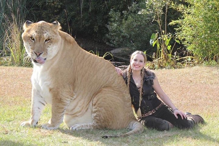
Alan Langsford returns in FF31 Battleblade Warrior (1988) -  his ORC SHAMAN looks on while what looks like a horned BLOOD ORC drinks from a normal ORC corpse. The face of the shaman looks something of a Liger whilst it's good to see the animal-pelt headdress remains from Paul Bonner original, it's a shame the leopard print kilt seems to have vanished.


FF34 Stealer of Souls brings us yet more ORC goodness from the pen of Russ Nicholson. It seems he has adopted the simian faces, rather than the  Russ's signature wrappings and heavy ornamentation. Its a convergence of styles that is going to stay around for a while.

FF36 Armies of Death Nick Williams. The human proportioned, round head, small nose physiology continue. This is the second image of an ORC with a large mallet like hammer.


Then, Chris Achilleos returns with his cover for The Trolltooth Wars (1989) entitled "Orc Hero" Again, this piece can be purchaed from Chriss website as an Art Print. It features a bodybuilder-esque ORC fighting a SKELETON. The Orc has a scimitar and a curved knife - popular weapon choices. 


MUTANT ORC complete with tentacle and crab hands.
David Gallagher, in FF39 Fangs of Fury, FF41 Master of Chaos (1990)and FF43 Keep of the Lich Lord (1990) who apart from the Tusker, the boar-headed orc, but the heavy bottom-lipped, bald-headed fellow follows very much the same human-proportioned, muscular design as established by John Sibbick, Russ Nicholson and Nick Williams. There is also at least one other one by David which I've missed the image of, with a top-knot once again reinforcing its relationship with the ORC. The Boar-headed fellow, while clearly some form of MUTANT ORC ties the Fighting Fantasy Orc into the Ploobian Orc genus, with it's genetic heritage in Chinese folklore, Disney movies and Star Wars. Moving swiftly on, without getting too side-tracked...


In FF 44 The Legend of the Shadow Warriors  (1991) we meet another tribe of unruly ORCs - the Black Scorpions of Witchteeth Mountains, illustrated by Martin McKenna, but showing a lot of influence from Paul Bonners orcs - the shaman dressed almost exactly as the earlier illustration in Titan, and the figures in the back seem to me to bear something of a similarity to some of Pauls work in the Warhammer 40,000 supplement Waargh the Orks (1990). 


FF 54 The Legend of Zagor (1993) illustrated again, by Martin McKenna, but slightly less squat and bow legged, although he is sat down whilst enjoying a tasty rat. Apparently there's a lot of sitting around if you're an ORC in Fighting Fantasy land....

Although it's actually an OGRE sitting down in this one, and a grinning ORC in the foreground, with his ear-ring, fur and scimitar, that's an OGRE on the throne. Odd, that seating is such a theme in FF illustrations and this one seems particularly familiar....


Ian McCaig's Casket of Souls! (1987) both Legend of Zagor and Casket of Souls are set in Ian Livingstones world of Amarillia rather than the traditional Titan where most Fighting Fantasy is set.But nonthless, the bald, snub-nosed, wide-mouthed ORC is very much in evidence.


and another one by Martin McKenna again, from Legend of Zagor.

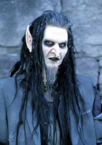
Wizard Series FF21 Eye of the Dragon (2005) (based on the mini dungeon in Dicing with Dragons, which also features an illustration of a Runequest Tusk Rider, as well as another Russ Nicholson ORC, but it's not strictly Fighting Fantasy so we'll leave it there) illustrated again by Martin McKenna, although some 10 years since the last ORC. The  Morning Star returns from way back in Deathtrap Dungeon, cementing it's place as the ORCs weapon of choice alongside scimitars, axes, two-handed mallets). The deep set eyes and pointy ears bring to mind  Mortiis or Mug Mecklebones from Ridley Scott's 1985 movie Legend. However I think what we're really looking at is the influence of Weta's  2001-3 adaptation of The Lord of the Rings.
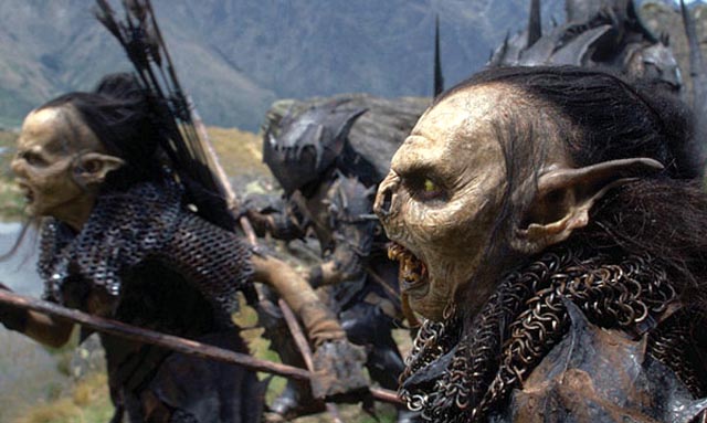
ORCS in Peter Jacksons adaptation of The Lord of the Rings
Not that large pointy ears are particually new, if anything at all, they are one of the most consistent features of the ORC.


Gavin Mitchell's forthcoming comic-book adaptation of Steve Jacksons Fighting Fantasy Novel The Trolltooth Wars. The HELLHOUND handler is a HILL GOBLIN and the large, hulking creature in the background is  supposed to be an ORC (if I'm not mistaken, it could be a green OGRE) who appears very much in the Simian-Hulk vein that can be seen in the Fighting Fantasy 60mm figures, and is recognizably following last seasons World of Warcraft and Warhammer ORC imagery. I say "last seasons", as the ORCs in the Warcraft movie seem to not be green any more, and Warhammer got blown up or something.

The representation of the ORC in Fighting Fantasy never really rests or settles. Each artist brings their own predilections, influences and ideas of what an ORC may be like, and the world of Titan embraces it. Occasionally the artists follow the popular design of the times, occasionally they strike out on their own, occasionally they build upon previous Fighting Fantasy imagery and occasionally they completely reinvent it. Unlike the videogames and movies of today Fighting Fantasy didn't have a team of concept artists sit down and define the look of everything, instead Fighting Fantasy grew, piece by piece, ORC by ORC.  Many of the illustrations are classic, ORC-defining pieces of imagery in their own right. There are distinct trends, recurring motifs and patterns in the design, suggesting deviating genetic branches, loops and whorls and subcultures of ORC.

We could try to fit the changes in the ORC to a grand historical narrative - exotic cultural motifs such as the top-knot giving way to more generic bestial features, or a degeneration from meerly grumpy ner-do-wells to foot-soldiers of evil, yet none of these stories really hold true. While any die-hard Fighting Fantasy fan may have their favorite rendition of these ubiquitous antagonists,  it is seemingly fitting for a book series that is essentially about branching stories, that there seems to be no linearity in the historical narrative of the Fighting Fantasy ORC. Indeed it seems to return to a precodified view of monsters, where goblins, hobgoblins, fae, giants, elves and orcneas weren't strictly delineated groups as Gary Gygax proposed in his Monster Manual but instead sifting folkloric symbols for supernatural experiences and ideas that defy strict categorisation.

In pulling together this history, it has been hard to draw a line between it and other representations of ORCs - many of the artists who drew for Fighting Fantasy also had connections to Games Workshop and Citadel Miniatures, Russ Nicholson having supplied illustrations that served as designs for many of their earliest ranges, Paul Bonner, Ian Miller, John Sibbick and David Gallagher would all provide artwork for Games Workshop as concept art or based on their miniature designs (many features of which directly echo Tom Meiers earlier "Giant Goblin" designs for Ral Partha), which, when we consider that the first ever fantasy miniature produced was an ORC  ME1 Man-orc with Sword from Minifigs Mythical Earth range, sculpted by Dick Higgs in 1972  it seems not unreasonable to extend the circle of enquiry ever further.

Minifigs Man-orc with Sword

And when we consider Fighting Fantasy's inaugral visualiser Russ Nicholson was active in Tolkien fandom (providing illustrations for the Anduril zine back in 1975) and the near universal availability of Tolkien imagery, we inevitably find the tangled roots of the Fighting Fantasy ORC claw us back to the dark origins of the modern ORC to be found in the writings of J.R.R. Tolkien, and the artwork inspired by it.

Nontheless, what  Fighting Fantasy did was to encapsulate the ORC (and arguably many other fantasy archetypes) for a time and space, a time when for many kids, The Warlock of Firetop Mountain (which, after all, has sold two million copies) or Deathtrap Dungeon (topping the childrens best-seller list) encapsulated the ORC ZEITGEIST, create it's own, unique take on the monster and thrust him into unsuspecting homes, schools, libraries and imaginations where he had never trod before.