Perfect for the moshpit, demolishing a shed, taking up the patio, playing a wargame with your mates, gang-fighting in a turf war, growing your beard, hunting around vinyl record shops on around the East Village, planning interplanetary conquest or drinking a craft ale.
The new
destroy t-shirt on
Zhu Shop US - exclusive, but what is it all about?
Destroy: A History of a Time to Come
 |
| destroy [zhu] 2015 |
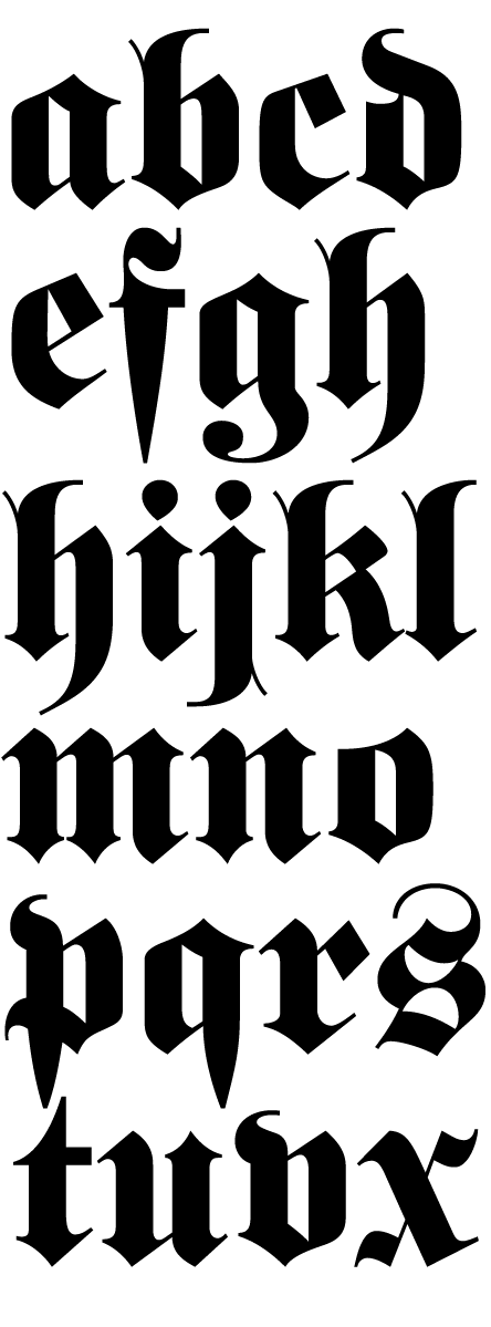
Blackletter. In the middle ages before printing was invented, everyone used to copy out books by hand. But of course, not everyone could read - only those with an education, and they tended to be members of the Church. Blackletter as a form developed out of the scriptorial tradition, the rigours of writing with quill on parchment - it is essentially a sequence of rhythmical down strokes and flicks.
 |
| blackletter |
Once printing and mass production of the book arose, Blackletter, as the dominant form of writing, became codified as typefaces of the kind used by William Caxton (1476) and Johannes Gutenburg (1439) for the first European printed books, and the letterforms continued to dominate the written word for a few hundred years.
Around the 15th-16th century, Blackletter became hugely unfashionable in parts of Europe, including England, mostly due to The Renaissance and the love of all things Roman - so their letterforms began to dominate. In England, the older, more worn out, cheaper typefaces used by low cost publishers for books of less value and a cultural split between the high, learned, refined, cultured, civilised, of the Roman Antiqua and the low, debased, popular, parochial Blackletter formed...
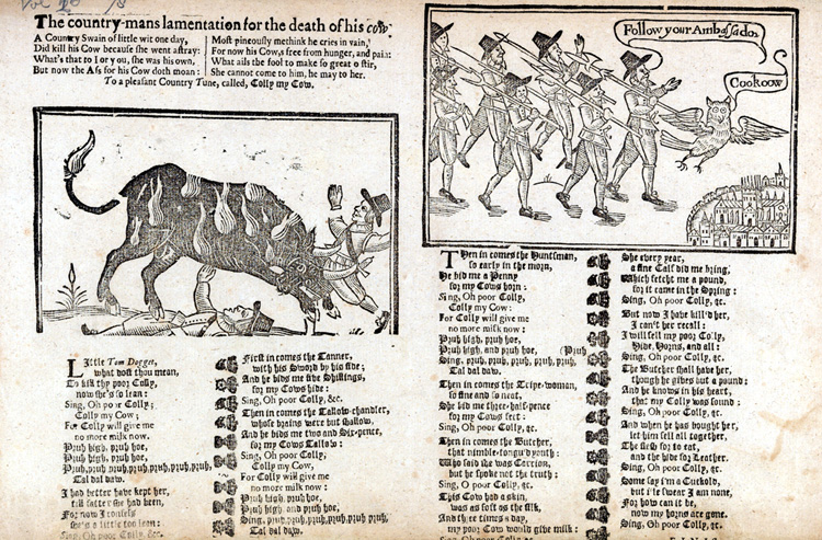 |
| The country-mans lamentation for the death of his cow English 15th C. Blackletter |via |
However Blackletter continued to be used in Germany for serious as well as popular works, and remained for quite a long time, often being used alongside the now more familiar Roman-derived Antiqua (as the Broadsheet ballad above illustrates.
In a time when people actually cared about typography as a cultural activity more than just snarking at Comic Sans MS a wide-ranging cultural debate about
Antiqua vs. Blackletter held in central Europe. During the 1940s Blackletter forms were greatly used by the Nationalsozialistische Deutsche Arbeiterpartei for propaganda purposes (and I think therefore feels 'Germanic' or 'Gothic' to the Europeans who went full-bore Antiqua) but subsequently denounced by Adolf Hitler for being
too German. Yes. Really.
 |
New York Times | Blackletter since 1851
The Times of London, however, converted to Antiqua thanks to Stanley Morrison in 1931s |
And I think from NYT through to NY Gangster Rap - a kind of regionalism. So that brings us nearly up to date, Blackletter type can still be seen on pub signs, cider bottles, tobacco tins, rock and rap album covers, gang tattoos, beirgartens, mexican stakehouses, newspapers, RPG products and the sides of Proto Space Marine helmets busy carpet bombing the planetary surface of Lave...
Nobody expects the Space Inquisition! Well, apart from people who frequent this blog, who frankly just scrolled past the fascinating and illuminting history of typography looking for the 1980s gaming reference whilst humming
Wild Boys by Duran Duran to themselves (go on, admit it). It's one of my all time favourite images from Warhammer 40k. As far as I know, no miniature was ever produced that looks like this guy. No rules for carpet bombing battlecraft ever written. It's like an entire gaming universe compressed into a tiny atom, awaiting the next big bang, an unexplored parallel dimension, radically different to the one we know yet somehow familiar.
But just what is the word "destroy" written in blackletter doing decorating the side of some galactic space warriors defensive armour in the year 40,000?
Military Folk Art
One reading is that the word 'destroy' may be part of a tradition of decorative military folk art, provisionally starting around WW1 and continuing right through to today.
Nose Art, painted on military aircraft more often than not tends towards pin-up girls,
Memphis Belle
being among the most famous. Perhaps a slightly depersonalised
recurrence of the Chivalric lady's favour, the ideals of courtly love
and honour - and indeed some nose art were
painted as reminders of 'girls back home'
whilst simultaneously identifying an aircraft and its crew, whose
flight jackets may also carry the image, the genuine intermarriage of
identity, group and symbol that most branding companies can only ever
pay lip service to.
Alternatively the designs appear aggressive and animalistic - the shark
tooth patterned Nose Art above a prime example stemming from WW1 German
fighter planes alongside kill / mission markers. Often these can appear
more comical than frightening, but they could be a relic of the totem
animals found in many warrior cultures,
 |
| Warhawk with Sharktooth Nose Art |
 |
| Blood Angels in Corvus Armour with Sharktooth Helmet Art |
 |
| Blood Angel miniatures with Sharktooth nose art | via the inimitable Jonas |
While the shark-tooth pattern that we see on fighter aircraft. We can see the warrior-animal thinking taken to its extreme in 40ks Space Wolves
It certainly appears that military folk art is part of the visual
language of Rogue Trader Space Marines - and it must be said - other
forms of power armour, such as that worn by renegades and orks. The
lettering in Dave Andrews original piece appears to be hand-painted,
perhaps because it is hand painted,
but perhaps it is also representing hand painted 'graffiti' which lends
some weight to this reading.
But pure
writing, as we see in Dave Andrews, rather than the primarily
representational forms of Military Folk Art seems reasonably rare until the Vietnam War (1955-1975), where Helmet Graffiti became widespread:
 |
| Vietnam Helmet | via |
This development during the Vietnam War intersects directly with the history of the
mass produced marker pen - the "Magic Marker" first invented and sold by Sidney Rosenthal in 1955 in the US,
and the modern felt-pen invented by Yukio Horie of the Tokyo Stationery Company, Japan in 1962. The medium is the message - the enabling factors of new writing technology finding expression.
 |
| The 69 and the Military Marker via |
So iconic did the practice become that film maker Stanley Kubrick chose that particular language to graphically represent his film
Full Metal Jacket (1987) the frisson between the signs of the poster and the film are an essay unto themselves (the nature-nurture duality of the phrase
born to kill for a movie 50% about military
training)...
 |
| Born to Kill | Philip Castle | via |
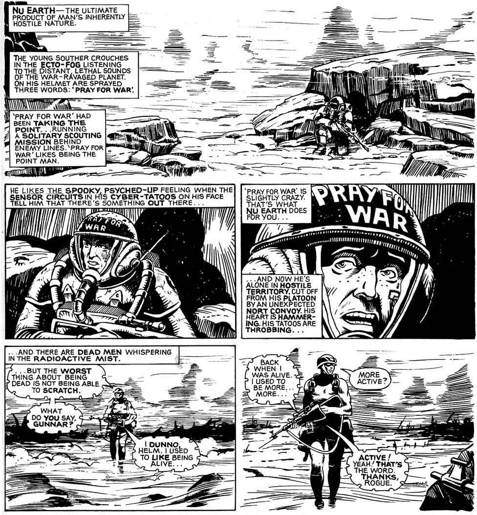
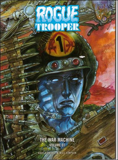
Similar graphic territory is scouted out by Alan Moore and Brett Ewins in their 1983 Rogue Trooper strip "Pray For War" - where Rogue (who in a later incarnation dons the name and the helmet graffiti
Friday ) meets a lost Souther whose helmet proclaims his self-identity
Pray for War...
 |
| Pray for War | Brett Ewins (art) Alan Moore (writing) | Rogue Trooper 2000AD | 1983 |
This admixture of warriors name, identity and military equipment seems to go back thousands of years. Thinking
Seax of Beagnoth, a 10th Century Anglo Saxon blade inscribed with a set of Futhark (the runic alphabet) and the name Beagnoth. It's unlikely that Beagnoth, like Gunnar, Helm, Bagman, Sting or Stormbringer is the name of the item itself, and historians are unlikely to ever decide whether Beagnoth is the name of the owner of the blade, or the signature, the brand-name of the manufacturer.
 |
| Beagnoth |
Destroy The Brand
So another reading of Dave Andrews 'destroy' Space Armour, may be that 'destroy' is the name of a manufacturer of space suits and powered armour. A brand, perhaps like '
No Fear', or
Destroy Skateboards, RoZ favourites
Disturbia or some other biker/sports/punk/goth crossover brands, gone into the manufacture of space suits.
Significantly for my design, fashion designer
John Richmond incepted his street wear brand
Destroy in 1987 - he same year as
Rogue Trader was published. Richmonds streetwear label fused a rock and roll biker sencibility with an activel, clean sports wear aesthetic. If Dave Andrews was making an intentional reference it would have required to have the finger on the pulse of British fashion design. Possible.
 |
| Destroy | 1987 |
It's also interesting to note that
Ace from Doctor Who made her debut in 1987 and Red Dwarfs
Dave Lister in early 1988. Heavily patched up leathers becoming a British sci-fi signifier for slacker / rebellious yoof. Something in the water? Can anyone hear the distant drum machine of
indie-pop-industrial-lite Grebo?
 |
| Destroy | 1987 |
Richmonds 'Destroy' label entered similar graphic territory as
BOY london and continued the punk legacy of
St. Vivienne Westwood' and
St. Jamie Reid. Barney Bubbles work with Hawkwind. However, unlike St. Viv, Richmond filed a Trademark on the word "destroy".
 |
| Destroy. Jamie Reid (graphics) Vivienne Westwood (shirt) |
My t-shirt production company
Spreadshirt do their due diligence - and so have pulled my design as it might infringe John Richmonds ownership of the mark. Anybody who knows me also knows I'm a big defender of peoples intellectual property, so while I am somewhat miffed by not beign able to release the t-shirt, I fully support the legal and economic process that allows this to happen.
Arguably the trademark is dormant - John Richmond isn't selling Destroy branded clothing, and arguably, if anyone was to do so, nobody would assume that the garment had been designed by John Richmond, it's lost currency through inactivity. However, I say "arguably" but I don't have the means or inclination to pay for a professional to make that argument on my behalf.
Richmonds solicitors have
yet to respond to my request to clear the use of the word. The
trademark is due for renewal in March this year, and there is a chance
they will let it drop, in which case the shirt will be released in the
EU. Until then, it's US only.
But hey, John, if you're reading this, drop me an email, let's rebuild Destroy. There has never been a better time for the brand to make an impact.
Supermodern destructivism
We live in the age of
supermodern destruction, where "film critic"
Lewis Beale talks of
the spectacle of destruction as a kind of pornography, but without acknowledging Ishiro Honda's
Gorija as Hiroshima and pretending that the post-WTC imagery is something new, has he even seen a single 1970s disaster movie, not even
Irwin Allen's Towering Inferno ? How did this guy even get a
job writing about cinema with absolutely zero knowledge of it past the last 5 years?
That Beale chooses the sensationalist word
porn over the more critically adept and meaningful
spectacle seems to belies his own fetishisation of violence. Pornography involves
people, the spectacle of destruction involves
things, confusing things and people sociopathic tendencies and the transference of desire that's the literal meaning of a fetish. The phrase "destruction porn" reeks of the kind of vacuously desperate, foot-stamping, attention-seeking that has become rampant in our fragmented and hypernetworked reading experiences. From tawdry
clickbait headlines and a to fill the endless void of the internet with meaningless distracting "content". Instead of culturally informed critics expanding our understanding of subject matter, we get armies of jibbering self-important idiots pointing at stuff they have no critical understanding of screaming look at me! look at me! I show you thing!
Destruction as an aesthetic response is not new in the Supermodern landscape, we can talk
JG Ballard, Punk,
David Carson, Godzilla,
Cornelia Parker, Burroughs cut-ups and countless other
works that celebrate the end of
things, like a gnostic release from the hell of the material world - if anything the spectacular destruction of the inanimate and symbolic apparatus of society remains one of the enduring motifs of the post-nuclear age, not a fleeing, momentary knee-jerk reaction to any particularly single social or historical event, but reveals itself to be one of the great meta-narratives of Supermodernity.
|
 |
| Sketch: Work In Progress | Graphite on Laserprint | [zhu] 2015 |
|
The classic, controversial 'destroy' t-shirt black and blue, limited to 66 pieces world wide, and available in the US only:
Don't forget there are also an ever decreasing number of Rogue Trader, Evil Empire and Oldhammer First Edition, Oldhammer ov Khaos shirts which are available through
Zhu Shop EU
As ever, please note I only design these shirts, and am not responsible for their manufacture or delivery. Please familiarise yourself with spreadshirts generous returns policy in your area before ordering. Either I've put on weight, or Spreadshirt sizes tend to come up "small", so usually order one size up. This advice may not be appropriate if you are not an English Male with a serious biscuit habit. Please consult your fashion advisor.


.jpg)


