Tuesday 23 September 2014

Rogue Trader T-Shirts

Some new 80's British Sci-fi inspired retrowear for you comic book loving leadheads!

Rogue Trader T-shirt Graphic concept
Rogue Trader T-Shirt

Rogue Trader T-Shirt close up.


I expect that this doesn't need explaining and I suppose that's all part of the humour. There are those who will know and get it, and those that won't. After a brief trail of the graphic on Facebook garnered enough likes to make it wasn't just me...


GI-Blue Rogue Trader T-shirts are available in both mens and ladies styles via http://zhu-shop.spreadshirt.co.uk/  in a limited edition of 66 each (3 of the mens have already seem to have gone before the official launch). For those outside Europe it might be more cost effective to order from the US store http://zhu-shop.spreadshirt.com/ - styles vary slightly.


But for those who would like an explanation, one follows, of sorts...

Rogue

The design is heavily indebted, if not an outright homage, or perhaps parody, to Dave Gibbons logo for 2000AD strip Rogue Trooper, which first debuted in 1981.


Rogue Trooper / Dave Gibbons / 1981

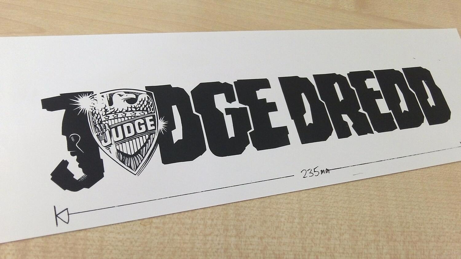
Rogue is hand rendered, somewhat similar to  the Judge Dredd logo (by recently passed) Jan Shepheard. The original Rogue Trooper logo contains, what I consider to be some very subtle and clever typography - the negative space of the R and the UE making an up arrow and a down arrow - iconic representations of the Nort and Souther, one invading the south, heading down, and the other invading the north, going up. Both ideas clearly echo the army insignia of the Norts and Southers (which arrow up and arrow down, indicating their desired global movements), and reflecting the face in the J of the Dredd logo. In the Rogue Trader T-shirt I've attempted to echo this with approximations of a las-rifle, bolt-pistol and jagged close combat attachment, in the U G and UE spaces. It's supposed to be loose, so don't worry if the shapes just look like angular blobs, that is all they are really.

Judge Dredd / Jan Shepheard 1977


Both Rogue and Dredd logos are, I believe, based loosely on Data 70 by Bob Newman, published by Letraset as rub-down transfer lettering - a response to the growing popularity of  Westminster , designed by Leo Maggs and itself based on fleshing out MICR-13 - a magnetic character set intended to be used by machines to read numerical data back in the late 1960s, when computers didn't have amazing graphical processing capabilities that they do today. It was regularly seen on the early covers of 2000AD as a title font and for various other jobs around the comic, including the "Credit Card" acknowledgement for the Script and Art Droids, as the creators are known, so was clearly known by the designers of the comic. Its use in communicating "this is about computers" or "this is about the techno-future" lasted throughout the 1970s and well into the 1980s, before digital technology caught up with traditional print in the mid 1990s, and 'technology' became largely normalised, and not something that required peculiar letterforms or needed its own typographic expression.

Dredd and Rogue logos are by no means clean mechanical reproductions, in fact their jagged punchy edges as much resemble graffiti from the period as anything else. By 'period' I mean the early 1980s and  old school block style , not graffiti of the war torn future of  Nu-earth, although of course they are the same thing. The implication of the design is a future society where specifically mechanically-readable text has become the dominant script so it informs the vernacular of criminal vandalism. Exactly. Of course graffiti here when tied with 'rogue' communicates that awesome sense of rebelliousness that epitomises the character.

Trooper


Trooper set in Futura Black, designed by Paul Renner in 1929. It's relationship to standard Futura is not alltogether obvious, I get the feeling Renner was taking traditional germanic letterforms into the same geometric space as his Futura did with roman, but my German ist nich sere groß, and I'm not even sure Renners original notes and theory on the design have been published, wither way the braod strokes weight and narrow white space suggest such a thing.

Bold stencil lettering was, and still is used by the military, which is, I think, the intended resonance here rather than early 20th century European typographic discourse. Renners geometrical abstraction and simplified forms give it an edge that contrasts with the jagged and complex Rogue. Tension between individualism, the 'hand made' 'rogue' and universality 'machine made', "Trooper" seems a meaningful dichotomy.

Enter the Trader 

"That's all very well and good but it says Rogue Trader not Rogue Trooper".Yes. Indeed.


Original Designed by Chaz Elliot and Jez Goodwin | 1987
Warhammer is a re-drawn ITC Serif Gothic, designed by Herb Lubalin & Tony DiSpigna in 1972 (Lubalin Graph, Herbs geometric slabserif, is used in Warhammers Forces of fantasy)  If the broken edges, distressed typography and semi-roman semi-uncials of the original Warhammer Fantasy logo speak to an antique and ancient world, the hard clean lines and compactness speak to the future. Copperplate gothic, that is a font taking a geometric sans-serif and adding small serifs, often in imitation of 19th C. copperplate printing. ITC Serif Gothic can be seen everywhere from Star Wars to Star Trek: The Motion Picture, to He Man and beyond - and built a venerable legacy in the science fantasy genre, although note that all these examples use the alternate round E that isn't available in the digital version, also selection bias - it could have been just as popular in 1970s sit-com titles for all I know. The tooled line-through the letters vaguely reminiscent of Blade Runner,  and the 3d block a weight that somehow suggests manufacture, like metal type, an automobile badge.

 
The all important "Rogue Trader" in a bold, redrawn version of Franklin Gothic. The redrawn has a considerable amount of quirk - the bowl of the R changes alignment in each appearance, the space between the tail and main stroke of the G has been filled-in, simplifying it and the proportions are slightly wider than found in most specimens. The overall effect is quite similar but less extreme of that found in the relationships between Data 70 and the Judge Dredd logo, but here is simplified, almost streamlined in a way that dissasociates the form from the method of production and instead - almost like an aliens impression of roman letterforms.


Notably both are from ITC. It was common back in the day for a designer to re-draw a font for a logo, copying from a type catalogue (or enlarging on a photocopier and tracing that), as it was both cheaper and faster than typesetting by film or wrestling with the Letraset.

I'm going out on a limb and say that I think the 40,000 is completely hand drawn and not based on an original. It does carry  a stencil feel with the breaks in the 0s and a strange, alien quality, slightly reminiscent of Rodney Matthews- as much of Jes Goodwins design often is. The oval shapes the eldar wraithstones .The whole thing set off against Jez Goodwins Imperial Aquila.


Rogue Trader cover.

Overall the impression from the logo is that of construction, Warhammer is rendered as metal, notably in contrast with 2nd edition WFB, they've turned the gold to chrome - the metal par-excellence of the Cyperpunk generation and a rough brick stone, placing rogue trader in dull brass, all-together somewhat architectural in its final realisation.


The History of a Game to Come


"Right, all very type-o-geek I'm sure, but this looks nothing like the design, what are you going on about?"

Back in the dawn of time (1983?) games designer Rick Priestly was working on a space combat game called Rogue Trader. As this was 1983, and not 2014, it wasn't launched as a Kickstarter, instead it got morphed / shelved/ and turned into the ground breaking  Fantasy-in-Space skirmish game Rogue Trader. Meanwhile Games Workshop had secured a license to produce various 2000AD titles as games and miniatures (although the two companies had also collaborated in 82 with Ian Livingstones Judge Dredd boardgame), Rick had written Judge Dredd the Roleplaying game (85), and his Warhammer co-author Richard Halliwell had recently published a board game based on Rogue Trooper (87). This, of course meant that the game design studio was awash with the Thrill-Power leaking from the piles of old Progs and eventually sucked up by the very fabric of the 40k universe. GW published  the Grant/Wagner/Ewins creation Kaleb Daark  and Ewins would go on to illustrate the fantasy rugby-in-armour game Bloodbowl and Chainsaw Warrior. ...

Or in other words, it is not really surprising there was a lot of influence taken from 2000AD and put into Warhammer 40k. Naturally artists working on 2000AD were hired to do illustration work, and much of the set and setting mirrored, transformed and combined aspects of 2000AD stories, there are other clear influences from other science fiction and fantasy sources in Warhammer too, but 2000AD, and Rogue Trooper are up there.

Add caption


The story goes that GW decided to add on Warhammer 40,000 to the already established "Rogue Trader" name in order to avoid confusion with the recently released "Rogue Trooper" board game. Now this story may be 100% true and accurate, but dropping the confusing "rogue trader" all-together as GW would later do with 2nd edition 40k, makes a bit more more sense and have stopped any confusion before it started. Halliwell & Priestly had published Combat 3000 through TTG back in 1979 whilst 2000AD itself had started in 1977  - still noticeably similar, compare Space 1999 (Gerry Anderson 1975-77). The game is literally 2nd Edition WFB with Laser guns and loose formations, so calling it some variation on "Warhammer in Space" or similar makes more sense than naming after an unreleased answer to Starfleet Battles (which Citadel had been producing UK versions of the American craft back in 1980) or Star Force 300 (by Bob Connor of TTG) which Citadel bought various moulds for off of QT models to produce in their spaceship range. The "Something: Number" formula a clear indication of being science fiction in a pop/gaming context (heck, even Daft Punks Scifi Disco-Opera Interstella 5555) and quite sure Warhammer 40,000 does the job. So while there is no real intention to decieve, the retention of "rogue trader" does communicate to someone familiar with the comic that there is some kind of conceptual overlap with Rogue Trooper, a sense of being in the same general territory, if not the exact location, which is a fairly accurate description of what is in the book.

Q. What were we talking about again? A. Rogue Trader T-Shirt


So thus was born the Rogue Trader t-shirt , equating WH40K:RT with 2000AD:RT. And we could talk of the 'trooper' to 'trader' switch, the relation between war, imperialism and capital - especially in regards to grimdark and the deep space 17th Century Shipping Company milleu that Warhammer 40ks Rogue Trader characters seem to exist within. We could talk about Rogue Traders Souther and Space Marine design (as Rick Priestly has said), or GI's and the Imperial Guard (yes I even painted up my plastic Rogue Trader IGs as Rogue Trooper GIs back in the day). But really, this is just a blog-post about a t-shirt, and if you've read this far, your tea has probably gone cold and the cat might need feeding. Thanks for reading.

If you grokked all of that instinctively, in a fraction of a nanosecond, just by looking at the thing, then well, you're as far down the 80's British-Scifi-Fandom Gamer rabbit hole as I. If not, don't worry about it, one has a habit of overthinking these things. Nice shirt tho' eh?


UK Eurozone etc. : http://zhu-shop.spreadshirt.co.uk/ 
US Pacific Rim etc: http://zhu-shop.spreadshirt.com/


If you do decide you want one (oh, go on, go on, go on, say that you will) make sure to read Spreadshirts Fair Return Policy first. Bascially they offer 30 day no quibble refund / return policy. I'm responsible for the creative design, Spreadshirt do all the manufacturing and delivery. NB. Direct-digital they smell funny, like vinegar, wash it a bit and its OK.

Friday 12 September 2014

A Tale of Warlocks and Chaos

"you remember the rumours and stories the villagers told you: 'The Warlock's power comes from his cards.'The sorcerer sees your interest in them and you both rush for the table. You get there first. "Leave those alone," he screams. "or you risk my fullest wrath!'"

- Warlock of Firetop Mountain Steve Jackson & Ian Lvingstone, 1982.

This struck  a 10 year old me as a bit odd, to have this great evil wizard's magic tied to a pack of playing cards. But of course, Steve & Ian might not have had ordinary playing cards in mind at all all, but perhaps a magical spell casting tool, perhaps something like these:


A deck of cards from Warlock: The Game of Duelling Wizards,designed by Bob Connor, developed and published a scant two years prior to The Warlock of Firetop Mountain by Steve and Ians company Games Workshop and illustrated by Russ Nicholson.

Warlock: Despite the box art, there are no attack seagulls.

 Delve further into the deck, to find the Black Wizard card:

Warlock: I Am The Black Wizards


And compare with Russ Nicholsons design for Zagor - The Warlock of Firetop Mountain:

Warlock: I Am The Black Wizards


While not identical by any means, there are many similar motifs, and design themes run through the two characters.

Warlock is a game for 2-6 players, but  it needs 4 to work at all well. Each turn the player-wizards cast a spell by laying a card which attacks the player to the left, who can then cast a defence spell or loose, get sent to Limbo and then resurrect themselves by expending energy points. Remember the resurrection spell Zagor cast upon himself to return, in Return to Firetop Mountain ? Yep, almost exactly like that.  The battle rages on over a map of Stonehenge - which is a useful insofar as it shows who is in and or out of the each duel, and the final winner is given the title of... The Warlock.

So, on these points of intersection, the similar visual design, the magic spell-cards, the honorary title of Warlock, the resurrection mechanic, I'm going to declare Warlock: The Game of Duelling Wizards part of the Fighting Fantasy canon, and part of the magic of Allansia. Ta-Da!

Any discussion of magical card games that doesn't mention Magic: The Gathering would be crimial in its oversight. I've never played it and have nothing to say, but there: it is mentioned. However I did  Recently play the magically themed German card game Wizard Extreme, which is simple, elegant, tactical and social trick-taking, yet lacks any feel or flavour of the theme, the art on the cards nothing but something to look at, completely irrelevant to the numbers and suits which the game relies on. In contrast Warlock seems to be designed around the theme with little concern for tactical play, other than to sit out, shuffle through the card deck hoping to get some awesome powers, or enter the dual and see what happens. There's not much other brain-work to be done, other than determining what defence spells will work against whatever is assaulting you.

What Warlock achieves is being evocative of a fantasy world, and the narrative of summoning hordes of goblins or blasting firebolts really takes over, if you're the kind of roleplayer who does the silly voices, then this is a treat as you send in grim faced dwarves against your opponents goblins only to be thwarted by giant eagles carrying magic spears. The black and white cards by Russ Nicholson are ludicrously good, easily on par with the Fiend Folio and the early Fighting Fantasy. There's an entire Tolkienesque / Old School D&D fantasy world campaign here, strange sprites, despotic demons, grumpy goblins, dour dwarves, grim heroes, pious saints, eldritch magic swords.

Warlock

Warlock was designed by the late Bob Connor, a name familiar to wargamers - founder of Table Top Games, which alongside Bobs own wargames rules were responsible for giving the original designers of Warhammer an early start - Rick Priestly his first job in games (sculpting 15mm figures), publishing Bryan Ansells Laserburn Sci-fi rules and Halliwells fantasy wargame Reaper, and a huge number of other rulesets.  It is a small world after all, and as if to prove that, Warlock was also the original impetus for Julian Gollop (of Laser Squad, X-com etc. fame) to create the seminal ZX Spectrum turn based strategy game  Chaos: Magic & Death on the Plane of Limbo (you can play the original Chaos online here a new version - Chaos Reborn is forthcoming) published by who else, but Games Workshop.

There are some who call him... Tim? by Chris Achilleos

Tim the Enchanter causes Deja Vu, again.

The story goes that Julian wasn't allowed to play Warlock by the game geeks mafia at his school club, so he went off and wrote his own version, which he eventually programmed into his ZX Spectrum and became Chaos: Magic & Death on the Plane of Limbo. He makes some radical changes and improvements - the spells and summoned creatures now move around a grid rather than just clockwise, and it plays a bit like a skirmish wargame, albeit with  factions randomly drawn from the DM's miscellaneous monster collection of Gorillas and Wyrven miniatures...


...and thusly is born The Chaos Warlock variant, the board game of the computer game of the card game (expect a PDF some time prior to Ragnarök) or to give it it's full title:

 CHAOS WARLOCK: The Game of Duelling Magical Wizards on the Planes of Eternal Limbo and Death.

All you need is a the Warlock board game, a set of card stand-ups from Bloodbowl, Talisman (or different coloured Card Stands from EM 4), a chess-board, a normal 6 sided die, and a tolerance for shonky rules.

The aim is to defeat all opposing Warlocks, sending them to the plane of Limbo.

It's time to learn the real magic.


1. Set Up
1.1 Each Chaos Warlock draws 14 spell cards and chooses to be a Black or White wizard.
1.2 Warlock places their Chaos Warlock card anywhere on the edge.

2. Each Turn
2.1 The Current Active Warlock may cast 1 spell  - or cast 'disbelieve' at a spell card
2.1.1 Spell casting: One creature card placed on a square adjacent to the Active Warlock. summoned creatures may be equipped with weapons and defensive magic when summoned. Limit 2 items per creature. These cards are stacked behind the creature card.
2.1.2 Disbelieve: The Current Active Warlock may ask any to reveal what is there - if it is a blank card it is removed from play.
2.2 The Chaos Warlock and all his summoned creatures may move 1 square per turn.

3. Offensive Spells:
3.1 Offensive spells travel instantaneously on straight lines approximate paths.
3.2 If a non-targeted creature is in the way then it will hit that, not the target.

4. Defensive Spells
4.1 Defensive spells may only be cast in response to a direct magic attack against a Chaos Warlock.

5. Combat
5.1 When two creature cards (including Chaos Warlocks) arrive on adjacent squares,  turn both  to be revealed to the other player.
5.2 The card owned by the Current Active Warlock is the Offensive card.
5.3 The stationary card becomes the Defensive card.
5.4  Roll a dice,  add to the Offensive number (including adding appropriate equipment bonuses)
5.5  Roll a dice,  add to the Defensive number (including adding appropriate equipment bonuses)
5.6 The highest score wins, losing card is removed from play.
5.7 If the result is a draw the combat continues in the next players turn.

6. Special Rules
6.1 Cards which lose combat to the Siren are not destroyed but change allegiance to the Sirens Chaos Warlock.
6.2 Blank Cards are "fake" spells, zero combat value but work to annoy the opponent and reveal their creatures.
6.3 Chaos Warlocks may wield any non-assigned wield-able items in their Spell-book (limit 2)

Of course you could replace those Warlock cards with miniatures on the board, unfortunately the summoned creatures would be a bit of a killer on the bluffing and fog of war aspects of the variant,  but the wizard could easily be using what else, but a miniature of Zagor from Otherworld.


or perhaps the Evil Wizard that I had a hand in designing (!)

Evil Wizard


Let's hope Nicodemus and Yaztromo to get sculpted to use as White Wizards at some point in the future, because. let's be honest, they look just like the White Wizard cards from Warlock...