 |
| Character Record Sheet |
 |
| Regiment Record Sheet |
Warhammer 1st Edition Character / Regiment Record Sheet
It's often overlooked that Warhammer Fantasy Battle 1st edition, or rather Warhammer: The Mass Combat Fantasy Roleplaying Game to give it it's proper title had rules for Roleplaying. Granted, they weren't rated very highly on first release, but as a rules-light addition to Warhammer they work well enough, and when you consider that WFRP1e itself was little more than WFB 2 with simplified combat, an extra decimal place added to the stats, and a careers system bolted on, there's no reason not to dig it out and run with it.
Originally designed for my long dormant Play-By-Post game Deathspell Arena, the character sheets were intended to match the low-fi aesthetic of 1st Edition Warhammer, the flyers and box set inserts put out by Citadel during the period. In revisiting them, updated some of the layout and added a Regiment sheet for armies as an alternative to the scrappy notes on bits of graph paper torn out of an old exercise book (which is after all, properly old-school).
Having done the heavy lifting on the typographic research some time ago, getting the historical accuracy down was the easy part, and in terms of design the biggest challenge was to create enough room for the player to write everything with a blunt HB pencil, but keep it bare-bones and avoid the urge to over-design it.
As I've mentioned the typography in various places before, but not here, some notes on the typography follow:
Cubic PS
The main body text is set in Basic SV, a slightly grungy digital recreation of Cubic PS.
I believe the PC above is a typo, and it should be PS!
Cubic PS was created by Diablo printing as a daisywheel typeface, distributed by Xerox with their Xerox 860 Information Processing System. And if you have any doubt at all that this is the kit, here is a picture of Rick Priestly (not Andrew Eldritch) using the arcane technology of the ancients from the Autumn 1985 Citadel Journal:
Cubic PS was created by Diablo printing as a daisywheel typeface, distributed by Xerox with their Xerox 860 Information Processing System. And if you have any doubt at all that this is the kit, here is a picture of Rick Priestly (not Andrew Eldritch) using the arcane technology of the ancients from the Autumn 1985 Citadel Journal:
 |
| Rick Priestly | Cubic | Rank Xerox 860 | via Whiskey Priest |
And here is a brochure from the Rank Xerox company advertising said system.
 |
| Adeptus Mechanicus | Rank Xerox 860 | via |
The Rank Xerox 860 Information Processing System, ' partial page display'. Partial, because they also sold a bigger system with a large, portrait monitor that displayed a full page of text. Also sold alongside the computer was a Diablo, daisy wheel printer. The printer itself was described as "Letter Quality" using a series of spokes to stamp on an ink-filled ribbon, much like a robotic typewriter.
A daisy-wheel appears in the promotional video below, and also what looks like Cubic during a section about designs being taken from paper drawings and scanned, or designed on the computer. If so, Cubic may be one of the first digitally designed typefaces - rather than taking a paper drawing. Unfortunately the original designer of Cubic is seemingly untracable.
Interestingly there are many, strange parallels between the CAD/CAM being used in 1980s mass produced typographical equipment and modern plastic miniature manufacture. Not to mention the old masters casting type in lead...
Cubic PS was the main 'Citadel' house font for years, appearing in the Warhammer 1st and 2nd editions, the Compendiums. the flyers, White Dwarf ads, Orcs Drift, Blood on the Streets, Terror of the Lichemaster etc. etc. being dropped in 1986 with McDeath and the Spring Citadel Journal
Cubic PS was the main 'Citadel' house font for years, appearing in the Warhammer 1st and 2nd editions, the Compendiums. the flyers, White Dwarf ads, Orcs Drift, Blood on the Streets, Terror of the Lichemaster etc. etc. being dropped in 1986 with McDeath and the Spring Citadel Journal
Forunately designer Johan Winge heroically reconstructed a Swedish version of Cubic - itself a copy of the Xerox / Diablo original and released his effort, SV Basic Manual for free, which I've used here. It isn't a perfect reconstruction by any means, but rather an artefact of reconstruction processes Johan went through. Using this as a basis, Johan went on to create the much cleaner and slicker Cubiculum.
| Cubiculum type sample |
As noted in the type specimen above, Cubic manages to be both mechanical in its regularity and adherence to a base-grid and yet friendly because of its squared curves. Its tone is quite unique.
Linotype Egyptienne Bold Condensed
The headings in Warhammer 1st edition and on the character sheets are Egyptienne. These would have been originally set using Letraset rub-down transfers, each individual being rubbed off and so stuck down to a sheet of paper beneath. I'd like to say that I'd followed the same manual process, but I didn't.
 |
| Letraset Egyptiene |
The design itself however weren't created by the Letraset Type Studio, but were based on a 1950s revival of a much earlier typeface. From Fonts in Use:
The precise origin of this design is unclear, but Linotype credits Tetterode, ca. 1820. Tetterode’s successor, Lettergieterij Amsterdam, released Walter H. McKay’s Egyptienne schmalfett and breitfett (Bold Condensed and Extended) in 1955. [Reichardt] This Amsterdam revival was popular in the 1960s–70s and was later digitized by Linotype and others.
The name Egyptienne has nothing to do with the font being particularly Egyptian, but rather stems from the Egyptomania, in the 19th Century when everyone was mad on all things Egyptian, so would have been a fashionable name at the time, bit like how everything got a lowercase 'i' appended to it after the success of the iPhone. Indeed, the whole family of 'slab-serif' typefaces are called Egyptians by the same kind of people who call sans-serif faces Gothic.
And indeed Egyptienne was quite popular in the 70s and 80s.
 |
| 1971 via |
Charles Grant, The War Game uses the Extended (wide) version in both upper and lower-case. Rick Priestly has mentioned Charles Grants Battle in numerous interviews as providing an approach to designing war games which directly influenced the design of Warhammer, (and this is born out by a read of Battle), its interesting that they share the same typographic legacy as well.
 |
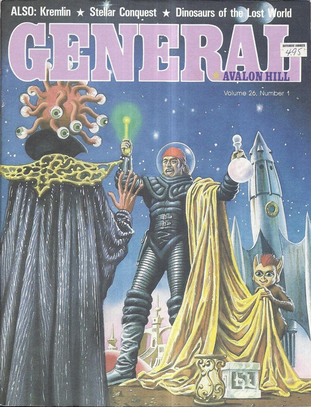
| Avalon Hill General |
Egyptienne was also used as the masthead for Avalon Hills General magazine from 1982 until 1993. A wealth of material, archive here. So many PDFs of old school goodness, so little time. Probably most significantly Egyptienne also appears as the main title Games Workshops 1980 edition of Runequest.
No doubt Egyptienne appeared in many other places as well. Although there is a grand tradition of using type based on old wooden letterpress fonts in fantasy gaming (everything from the original Dungeons & Dragons through to The Warlock of Firetop Mountain and beyond) Egyptienne exudes a kind of strudy, Victorian dependability, heavy, slightly oppressive and quite serious. I do wonder if the designers were hoping to conjour something of Egypt, vast ziggurats and cyclopean masonry rather than brick mills and playbills of early industry and reminiscent of other institutions of play.
Anyway, hope you enjoyed the brief history of early Warhmmer typography and get some use from the Character & Regiment Record Sheet!
 |
| GW Runequest | via |
No doubt Egyptienne appeared in many other places as well. Although there is a grand tradition of using type based on old wooden letterpress fonts in fantasy gaming (everything from the original Dungeons & Dragons through to The Warlock of Firetop Mountain and beyond) Egyptienne exudes a kind of strudy, Victorian dependability, heavy, slightly oppressive and quite serious. I do wonder if the designers were hoping to conjour something of Egypt, vast ziggurats and cyclopean masonry rather than brick mills and playbills of early industry and reminiscent of other institutions of play.
Anyway, hope you enjoyed the brief history of early Warhmmer typography and get some use from the Character & Regiment Record Sheet!


